India Home Health Care (IHHC) is a leading provider of home nursing and other Healthcare services. They work in partnership with BAYADA Home Health Care to provide patients with registered nurses, visiting doctors, physical therapists and more from the comfort of their home.
Mobile devices account for 90 per cent of total traffic to IHHC’s website, with most users accessing the landing page through 3G and 4G connections. However, the landing page loaded much more slowly than other pages on the site, negatively impacting lead generation. To maintain their foothold in the extremely competitive healthcare space, the IHHC team set out to increase their mobile leads by improving the landing page load time. They also hoped to increase conversion rates and reduce cost per conversion.
Goal: India Home Health Care (IHHC) wanted to generate a higher number and quality of leads at a lower cost-per-lead (CPL).
To make the most of high mobile traffic to the landing page, the IHHC team wanted a faster, more seamless experience for potential clients using their smartphones and tablets. Their digital marketing partner Social Beat (a Premier Google Partner) recommended Accelerated Mobile Pages (AMP), an open-source library that helps developers easily create fast-loading, mobile optimized web pages that scroll smoothly and look great on both mobile devices and desktops. Working with Social Beat, IHHC began to develop AMP landing pages for their Google ads to improve campaign performance. Implementing AMP was very straightforward, with each page taking only a day or two to build. Soon after the January 2018 launch, IHHC modified their AMP code to more easily monitor the pages’ effectiveness and track leads from their Google Ads campaigns. First, they added the <amp-call-tracking> tag, which automatically replaces static phone numbers with dynamically- generated numbers used for call tracking. Next, because some people prefer to submit a contact form, IHHC used the amp-analytics component to automatically sync form submissions with their Google Analytics account. Whether potential customers contact IHHC by phone or through the website, each new lead is automatically incorporated into the company’s CRM system. This enables them to accurately measure the impact of their AMP landing pages and Google Ads campaigns on final sales.
Within three months of launching their AMP landing pages, IHHC had reduced their average cost per lead by 33 per cent, while total conversions grew by 20 per cent. Meanwhile, the bounce rate was cut nearly in half for potential customers who reach an AMP page compared to those who visit the regular website. IHHC attributes these significant improvements to faster load times that help visitors get the information they need so they don’t grow frustrated and leave. AMP’s call-tracking support has proven particularly valuable, spotlighting ad messaging strategies that resonate with prospects.
“Our AMP pages load nearly instantly, which means that customers get a better user experience and they can focus entirely on learning about the high-quality services that IHHC and BAYADA provide.” —Revathy Sankaran, IT Manager, India Home Healthcare.
Since using AMP to optimize their ad landing pages for mobile, IHHC has generated more high-quality leads at a lower cost. Next, the team intends to create an AMP version of the entire website for mobile visitors who don’t find the company through a Google ad. They also plan to experiment with AMP HTML, which allows advertisers to build ads that load just as quickly as an AMP page on mobile, and Progressive Web Apps, which work with AMP to create immersive, full-screen experiences that don’t require installation.
We are also happy to inform that the case study has been published by Google.
Download the full case study for more details.
As the number of mobile internet users in India and around the world continues to grow, making pages more mobile-friendly will become one of the biggest objectives for brands to reach the next billion users. Implementing AMP could be one of the most effective ways for brands to become more discoverable and ultimately, gain higher conversions, whether you are a Real Estate Giant or a leading FMCG Company. So do try it out and let us know the results you get!
With almost 80% of search queries coming from mobile platforms, Google has been implementing new ways to make the mobile search experience more streamlined and convenient for its users. One of the most drastic moves to facilitate this was the introduction of Accelerated Mobile Pages (AMP).
On an average, pages take longer to load on mobile than they do on the desktop. This is especially significant in the Indian context as Indians have the highest amount of data consumption in the world and access the internet primarily through their phones. If brands want to engage India’s next billion internet users, implementation of AMP will become one of the most crucial differentiators.
Unlike its direct competitor (Facebook Instant Articles), AMP is an open-source framework which is very easy to access. A page can be AMP-enabled by modifying the website’s HTML code with certain specified tags or by implementing a specialised JavaScript framework. But even if you don’t have any experience with coding, you can still implement AMP if you use a CMS platform like WordPress. Just by installing a Google AMP WordPress plugin which is easily available, you can make your page AMP-optimised and help it load faster.
Google initially launched AMP for static content-heavy sites such as blogs. Since an AMP page is a stripped down version of the original version, it improves readability for the user. Implementing AMP on blog pages can have several benefits for the reader and the site owner.
According to a study by Kissmetrics on How Loading Time Affects Your Bottom Line, loading time is one of the biggest factors contributing to bounce rate. Over 40% of those surveyed said they would leave a page if it took longer than 3 seconds to load. A study by Tractus looked into the effects just a 1-second delay in page load time can have on several key metrics. They found that bounce rates increased by 8.3% and page views decreased by 9.4%. This clearly shows that for a successful blog, you need more than just great content. You need an optimised page that improver a reader’s overall experience.
Implementing AMP on blog pages can be one of the most important ways to help your website perform better. When a page loads almost immediately, users are less likely to abandon the page. They are also more likely to explore your site further and click on other links within it. Below is a quick glimpse of one of our blogs, where you can see significant improvement in terms of time on site – just because of the AMP blog page.
When a website implements AMP, they are very likely to see an increase in page speed, page visits, dwell time and a reduction in overall bounce rates. Incidentally, these are also some of the main factors Google takes into consideration when ranking a page. In addition, ever since Google’s algorithm started prioritising mobile-optimised pages, the implementation of AMP could further help improve your website’s SEO.
Implementing AMP will also help your website gain more visibility. AMP-enabled pages have a lightning icon next to them which helps them stand out from the other results displayed. Users are also likely to seek out pages with this icon, knowing that it will load faster. All of these factors can help a website rank high on a search results page.
For content marketers, analytics is one of the best tools to understand user behaviour, what kind of content is working and where traffic is coming from. Tracking AMP pages is very easy as there are analytical tools available to help you track page visits, link clicks, conversions and more on AMP versions of your pages.
Page load speed is a critical factor in improving a user’s experience, especially when you are trying to drive conversions. Understanding the importance of this, Google launched AMP for landing pages. Brands can significantly improve the performance of their landing pages by implementing AMP.
If you run an e-commerce site or any other online business, leads or sales are most likely your number one priority. But if your website doesn’t load quickly, then you could be losing out on valuable customers. The same study by Tractus found that 30% of shoppers who have a bad experience with an online shopping website say that they will never visit that site again and that they will not wait more than 2 seconds for a website to load. So if you want to improve the quality of leads generated via digital, optimising your page speed is crucial.
Implementing AMP could be one of the best measures to create a landing page that converts. There has been shown to be a direct correlation between page load time and the number of conversions. If a page loads quickly and the customer is satisfied with their experience on it, they are much more likely to purchase a product or complete any other call to action.
If one of the main goals of your website is to monetise through ads, then implementing AMP could help you achieve this. This is primarily due to the difference in the way ads are showcased on an AMP-enabled page as compared to a regular page. Since implementing AMP trims all the unnecessary elements of your page and streamlines it, ads are displayed more prominently and with fewer distractions. This can increase the number of clicks on an ad displayed.
Background: India Home Health Care (IHHC) is a leading provider of home nursing and other healthcare services. They work in partnership with BAYADA Home Health Care to provide patients with registered nurses, visiting doctors, physical therapists and more from the comfort of their home.
Goal: India Home Health Care (IHHC) wanted to generate a higher number and quality of leads at a lower cost-per-lead (CPL).
Strategy: In order to achieve higher leads for IHHC, we decided to implement AMP for their landing pages. Since a majority of the leads for IHHC came through mobile, enabling AMP would have a strong impact. Google ads targeted towards potential clients redirected them towards an AMP-implemented landing page. As this would significantly reduce the load-time of these pages, we predicted that it could generate higher leads for IHHC.
Results: The implementation of AMP led to a higher number of leads generated as compared to any other pages on the site. The two most important results from this were:
As the number of mobile internet users in India and around the world continues to grow, making pages more mobile-friendly will become one of the biggest objectives for brands. Implementing AMP could be one of the most effective ways for brands to become more discoverable and ultimately, gain higher conversions, whether you are a real estate giant or a leading FMCG company. So do try it out and let us know the results you get!
As dramatic as it may sound, generic home pages are dying. Gone are the days when websites welcomed visitors with the same page whether you are a millennial in South East Asia or a retired businessman in Mexico. Just like how old-school drip marketing is being replaced with customised emailers and native apps are getting substituted by new-age progressive web apps, universal home pages are being upgraded to pages that are personalized as per the demographics of the audience, and nothing in the online space is the same anymore!
Ever since we hopped on to the bandwagon of the Internet, digital marketing has taken over the world of branding and advertising. The ease in which you can showcase your company and literarily reach out to the palms of viewers across the world is unfathomable. Keeping this strategy in mind, why would you want to show the same webpage to all your visitors when each one of them has different needs and expectations from your brand? Let’s take a look at the benefits of personalising your homepage and the different ways in which you can wow your website traffic till you ultimately convert them into loyal consumers.
A tailor-made home page will help in generating premium leads as the page will display what you specifically have to offer for each visitor. Attracting potential clients by showcasing types of content they will find engaging is the basis of digital marketing and personalised web pages do exactly that.
Through customised home pages, brands can welcome their online visitors with a personalised message. This triggers a unique user experience as you add a personal element to your page, assuring viewers that you have already hand-picked your services as per their preferences and requirements.
Personalised homepages also add value to your marketing strategy by widening your global reach. Since you can personalise pages based on the location, you can now easily target consumers with what is trending in that particular locality. This makes the content on the homepage more relatable for the visitor and adds to the possibility of them converting to your brand.
Apart from showcasing the brand and attracting target groups, websites also provide business owners with a plethora of other useful information to understand online traffic. From the location of the viewers and the time of peak traffic to the type of content most-consumed on the website, marketers can observe the patterns of activity and use this to their advantage. Let’s understand this concept better with a hypothetical situation. Consider yourself to be the owner of a B2B organisation which provides end-to-end HR services. A potential client has recently visited your website through a Facebook carousel ad and spent seven minutes going through your HR packages. The next time the individual visits your website, they will either have to manually search for the packages they were interested in or bounce back with a last minute change of mind. However, through a personalised homepage, the visitor will be welcomed with a customised message. This message will showcase the services and packages they had clicked through with an effective CTA to either buy the package or know more about it. The unique user experience will draw the user into your website and boost the lead generation of your B2B organisation.
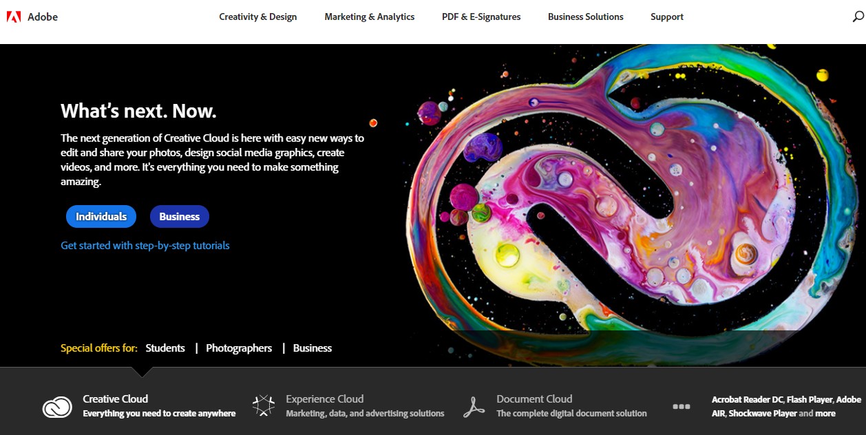
Adobe India is one of the first Indian websites who has upgraded their website with a personalised homepage. Visitors around the world are initially welcomed with a homepage that displays a blurb on their next-gen Creative Cloud segment. There are two CTAs – one for individuals who are interested in the concept and the other one for businesses.
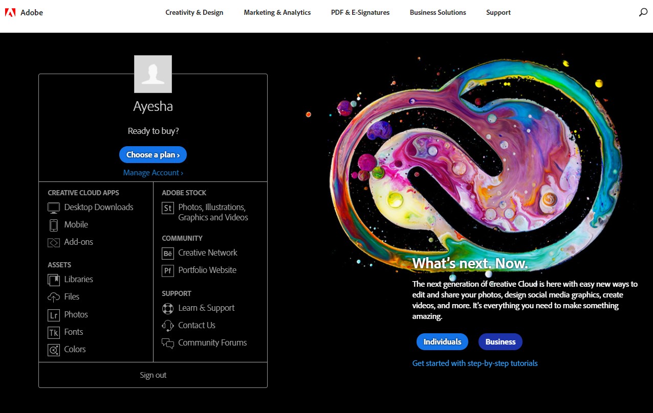
In order to explore the effectiveness of the personalised homepage, we clicked on the “Creativity and Design” tab and ventured into the field of photography by scrolling through the Creative Cloud Photography plan. After spending a good ten minutes on the website and surfing through the various plans available for individuals, businesses, students and universities, we clicked on the Adobe icon in the top left corner to go back to the homepage.
If the Adobe website had a generic homepage, one would expect the same page to show up as discussed above. However, since the website has a personalised home page, we were welcomed with a customised page which helped us continue from where we left. In this case, since we had browsed through the various Creative Cloud Photography plans earlier, we were welcomed with the blurb “Ready to buy?” followed by a CTA which helps us with choosing a plan as per our preferences.
As you can see in the above image, the blurb about the Creative Cloud is still present, but you also have a personalised message on the plans you were interested in earlier.
Personalised home pages work as an excellent marketing strategy for B2C companies and social media platforms as well. In a quest to provide consumers with what they are searching for, personalised home pages read the IP address of the visitors and categorise them as per the location. The visitors are then welcomed with topics and concepts that are trending in their locality or that are the most searched for in the region.
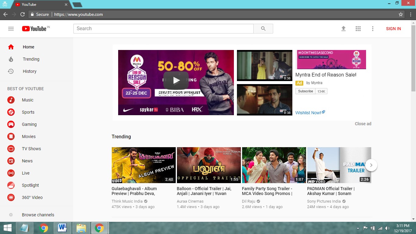
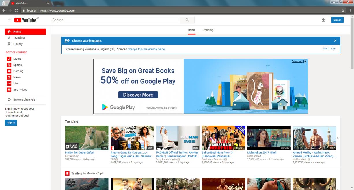
Let’s take the example of Youtube to understand this theory better. Youtube has personalised their homepage as per the location of the visitors and showcases all the trending videos in the region.
As you can see in the image above, Youtube viewers in India are welcomed with a series of trending videos that include snippets from the regional entertainment industry. The ads on the page are also targeted to the audience based on the location of the guest.
The image above is the same homepage viewed from Dubai. As you can notice, the URL entered is the same, but the content on the page is different. In this homepage, the trending videos are based on the popular activities of the region. They also include videos in Arabic – the regional language of Dubai. Additionally, the advertisements on YouTube are entirely different from the ones displayed on the homepage when viewed from India.
Big names in the digital space like Adobe and Youtube are already leveraging the benefits offered by the adaptive nature of personalised homepages. But, what about small-scale businesses and start-ups? The best part about this new-age concept is that you can personalise your homepage one step at a time. It is not a go-big-or-go-home kind of situation.
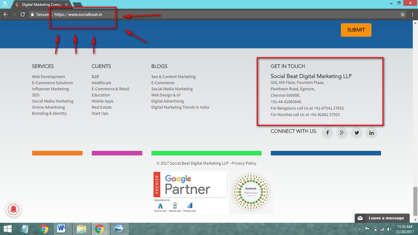
For example, we, at Social Beat, recently explored the idea of personalised home pages by customising our website as per location. With our headquarters in Chennai and regional offices at Mumbai and Bangalore, we decided to start by customising the address in the “Get in touch” tab as per the location the visitor is at.
As seen above, if you visit our homepage from Chennai, the “Get in touch” tab in the footer will display our Chennai address.
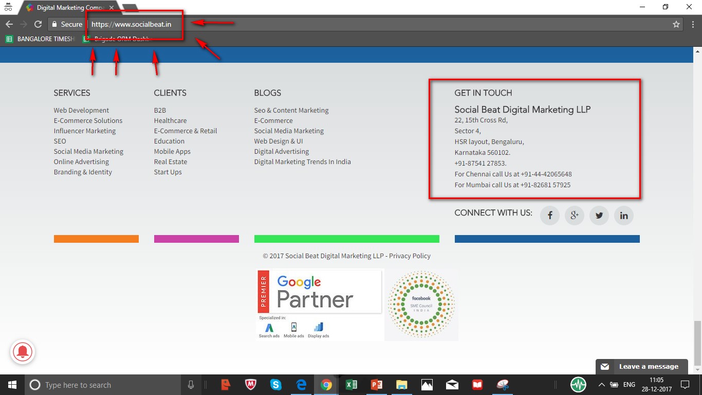
The same homepage displays the Bangalore address when you log in from Bangalore.
There are a wide range of tools available out there to personalise your homepage based on a multitude of integrations like Google Analytics, Hubspot and Wordpress. Let’s take a look at a few of them.
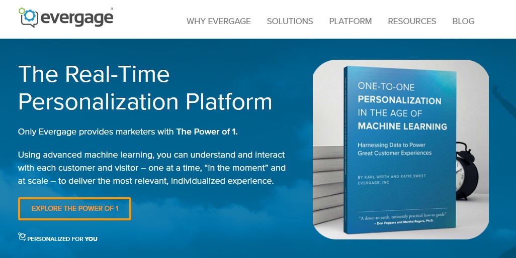
With this tool, your homepage will be personalised based on a variety of factors such as geographic location, data from their social media profile and CRM information, to name a few. You can also opt for a free trial or schedule a demo as per your preferences.
Evergage focuses on enhancing visitor engagement by providing them with a tailor-made user experience. Visitors are welcomed with more relevant offers and appropriate content which is guaranteed to help in lead conversions and customer success stories.
Apart from these tools, you can also check out Bound, Convert and Optimizely that are brilliant in examining your traffic and providing visitors with unmatched customer experience.
Now that you have a better idea about personalised homepages and the vital role they play in visitor engagement and lead generation, its time you upgrade your company’s website with this ground-breaking technology and stay ahead in the ever-lasting race of digital marketing.
Contact us at Social Beat and leverage the multitude of benefits a personalised homepage can bring to your business.
Considered one of the biggest property markets in India, Mumbai has many real estate developers trying to reach their target audience online. Digital Marketing is one of the primary channels to connect and engage with customers online and generate quality leads. The best real estate marketing companies in Mumbai have noticed this trend are willing to go the extra mile to help real estate developers tap the online space. Here’s a detailed report on the digital marketing strategies of the top real estate developers in Mumbai.
Lodha Group is one of the leading real estate developers in Mumbai and the most profitable players in India. They are known for making landmark developments in residential and commercial spaces and pioneering new trends.
UX Audit:
They have an interesting design of image slider that showcases all the project launches and promotions. The project locator is a nice filter functionality to find project developments. Project page showcases the projects based on their location and has the information about the price too. This leads to the enquiry page with project brief and lead generation form. The website is, however, not mobile-friendly as the text is too small to read and the contents are wider than the screen.
Key Features:
Web Insights:
| Total Visits | Avg. Time on Site | Page Views | Bounce Rate |
| 148.60K | 00:01:30 | 2.17 | 75.20% |
Moz rank: They have a Moz rank 42 for Domain Authority.
Website Speed:
Twitter: They have an active Twitter account with around 8000 followers. They do 20+ tweets a week and have no promoted tweets. They tweet about a wide array of topics ranging from their projects to the general industry based news. In spite of these, engagement is low on tweets.
Facebook: They have an active page with around 100000 followers. The engagement is good, highlighting the use of promoted posts. Their content includes customer testimonials and event invites.
LinkedIn: They are very active on LinkedIn and have around 47000 followers. Below is a recent post about demonetisation, which received a good response
Youtube: They have 720+ subscribers with not-so-engaging videos
Google+: Their Google+ account is active having 35 followers.
Instagram: The account is active and has 1500+ followers.
Content Marketing: Though the blog page is not very attractive, they are posting at least 4 articles per month. They have a live chat option on their blog.
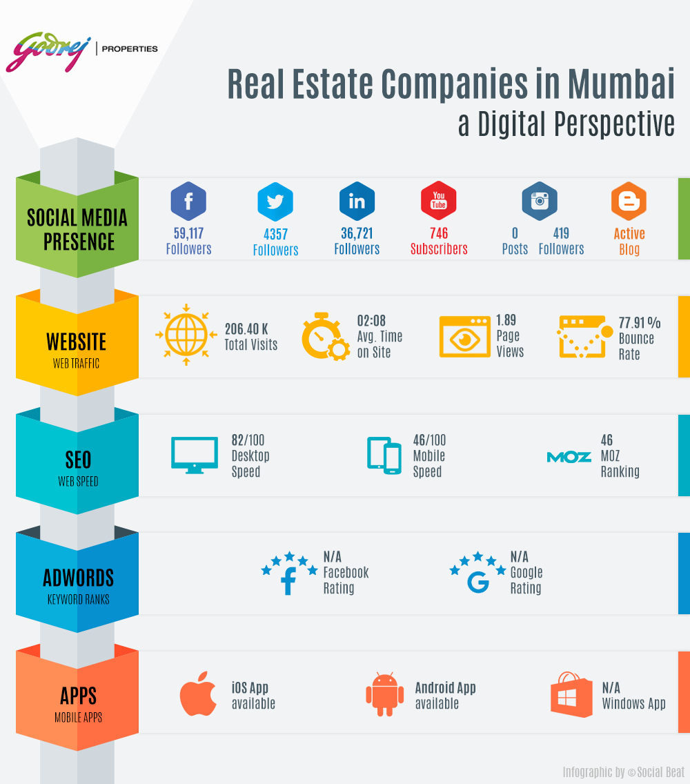
Godrej Properties develops residential, commercial and township projects across 12 cities in India. They provide imaginative and extraordinary spaces keeping customers’ needs in mind, making them one of the top real estate developers in Mumbai.
UX Audit:
They have a well-organised menu catering to different kinds of website users (buyers, investors, NRIs etc.) They also have a nice hierarchy for project menu, leading to different property projects. Individual project pages include features like project overview, highlights and enquiry form. Their page is mobile friendly.
Key Features:
Web Insights:
| Total Visits | Avg. Time on Site | Page Views | Bounce Rate |
| 206.40K | 00:02:08 | 1.89 | 77.91% |
Moz rank: They have a Moz rank 46 for Domain Authority.
Website Speed:
Twitter: They don’t have a twitter account for Godrej Properties.
Facebook: They are not very active on Facebook but they still have around 58000 followers. Below is a recent video post, which has received some responses and views.
LinkedIn: They are active in LinkedIn with around 36000 followers. Compared to other social channels they are more active on LinkedIn.
Youtube: They have 740+ Subscribers and videos in their channel are pretty engaging, having a decent number of views.
Google+: They have an active Google+ account having 474 followers.
Instagram: They have 400+ followers on Instagram.
Content Marketing: They have been blogging since May 2016. They have 15 articles as of now, and they have a separate domain for blogging.
Tata Value Homes is a subsidiary of Tata Housing. It is one of the larger real estate companies that focus on low-cost housing with modern amenities.
UX Audit:
They have allocations to provide a quick filter for the audience based on the city/location of the user. The quick search option leads to a map with property locations highlighted for user convenience. Showcasing their featured projects on the homepage with prominence is an interesting feature. Laying out interesting blogs on the homepage is another noteworthy feature.
Key features:
Web Insights:
| Total Visits | Avg. Time on Site | Page Views | Bounce Rate |
| 70.50K | 00:01:12 | 2.51 | 68.56% |
Moz rank: They have a Moz rank 30 for Domain Authority.
Website Speed:
Twitter: They have around 6000 followers. They aren’t tweeting on a regular basis and they use the same content across social media platforms.
Facebook: They have around 250000 followers and have boosted some posts a few months back, but recently they are not very active. Below is a boosted post shared a few months back which has a large number of likes and responses.
LinkedIn: They have only 110+ followers, and the page has no posts till date.
Youtube: They are current not active. Their last uploaded video was 4 months ago.
Google+: They have an active Google+ account with 85 followers.
Instagram: They are also active on Instagram having 1300+ followers.
Content Marketing: They have posted only 3 blogs in 2016, highlighting the missed opportunity in content marketing.
Mahindra Lifespaces is the real estate company of the Mahindra Group. They are one of the top real estate developers in Mumbai and the first Green Home Developer with Green Design & Healthy Living as their main focus across their projects.
UX Audit:
The web page has nice project filter on the home page following the banner. Sticky enquire now button to provide constant CTA is an interesting feature. A section to attract NRI investors is also present. Menu dropdown feature is quite interesting, especially the categorized submenu for projects.
Key features:
Web Insights:
| Total Visits | Avg. Time on Site | Page Views | Bounce Rate |
| 43.50K | 00:01:34 | 1.65 | 76.17% |
Moz rank: They have a Moz rank 39 for Domain Authority.
Website Speed:
Twitter: They are active on twitter with engaging tweets. Below is a public awareness tweet.
Facebook: They are very consistent in boosting posts and are active on Facebook, having around 125000 followers.
LinkedIn: They have an active LinkedIn page, which has around 26000 followers. They are posting engaging contents on a regular basis.
Youtube: They have only 160+ subscribers. They upload two to three videos per month.
Google+: They are not active on Google+ and have only 6 followers
Instagram: They are active on Instagram having 50+ followers.
Content Marketing: They don’t have a company blog.
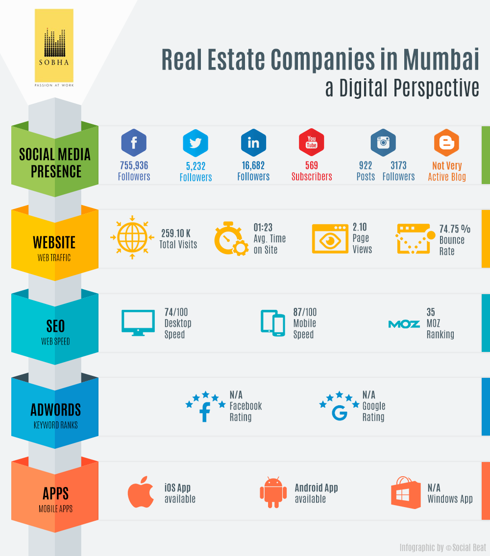
Sobha Group is one of the largest real estate organizations in India and the Middle East. They focus on delivering the highest levels of quality, with no compromise, making them the top real estate developers in Mumbai.
UX Audit:
The premium images rolling in the banner connects the user to the luxury of the brand. The main menu could have been more prominent instead of being placed against the sliding banners. Apart from that, the site has a very nice organization of the project information – presented state-wise and sorted by price.
Key Features:
Web Insights:
| Total Visits | Avg. Time on Site | Page Views | Bounce Rate |
| 259K | 00:01:23 | 2.10 | 74.75% |
Moz rank: They have a Moz rank 35 for Domain Authority.
Website Speed:
Twitter: They are very active in Twitter having around 5000 followers and they do 3 to 6 tweets a day which is a lot compared to other developers. They have a diverse set of tweets ranging from new project launches to general industry based news. Despite these, engagement is low on tweets.
Facebook: They have an active page with around 7 lac followers and they have been posting at least twice a day and the engagement is good. Below is an organic post which had a good response.
LinkedIn: They are very active in LinkedIn having around 16000 followers.
Youtube: They have an Active Youtube account with 570+ subscribers and they have interesting Testimonial videos.
Google+: They have an active Google+ account with 554 followers.
Instagram: They are active on Instagram with 3100+ followers
Content Marketing: They have a blog, which is not active.They do not have any mention about their blog on their website.
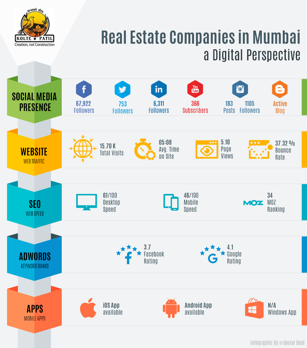
Founded 2 decades ago, Kolte-Patil has built residential, commercial, retail, and integrated township projects till date.
UX Audit:
Interesting zoom in feature on the banner images attracts the users. Well organized menu putting out all the necessary information is a great feature. Book Online page showcases all the projects with the quick facility to book. They also have live chat option in all the pages.
Key Features:
Web Insights:
| Total Visits | Avg. Time on Site | Page Views | Bounce Rate |
| 15.70K | 00:05:08 | 5.1 | 37.32% |
Moz rank: They have a Moz rank 34 for Domain Authority.
Website Speed:
Twitter: They have around 10000 followers and are highly active on Twitter. Their tweets are very engaging.
Facebook: They are having around 67000 followers and post twice a week.
LinkedIn: They have around 6000 followers and are moderately active on LinkedIn with 3 to 4 posts per month. Below is a post, which got pretty good responses.
Youtube: They are not very active and have only 367 Subscribers. Their videos have a decent number of views.
Google+: They are active on Google+ with 114 followers.
Instagram: They are also active on Instagram having 1100+ followers.
Content Marketing: Though they do not have an attractive blog page, they are posting 2 articles every month.
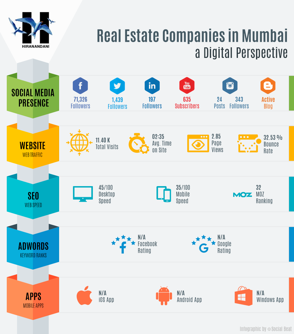
Pioneering new technologies & bold design, Hiranandani Developers have created residential townships & commercial complexes meeting the expectations & lifestyle of the people.
UX Audit:
Their Homepage design focuses on all the launches/promotions. Placement of a common enquiry form across all projects, to make enquiries for the visitor easier is appreciable. The website is mobile friendly.
Key Features:
Web Insights:
| Total Visits | Avg. Time on Site | Page Views | Bounce Rate |
| 11.40K | 00:02:35 | 2.85 | 32.53% |
Moz rank: They have a Moz rank 32 for Domain Authority.
Website Speed:
Twitter: They have around 1400 followers and are highly active on Twitter with at least 4 to 5 tweets every day.
Facebook: They do have an active page with 71000 followers. Below is a Selfie contest post, which was engaging and had good responses.
LinkedIn: They have only 190+ followers in LinkedIn and they haven’t posted anything until now.
Youtube: They have 630+ subscribers on Youtube. Though they are not active on YouTube, they have decent views for their engaging videos.
Google+: They are not active on Google+ and have only 29 followers.
Instagram: They are active in Instagram having 300+ followers.
Content Marketing: They have their blog in Weebly and actively post articles about real estate, their ongoing projects, and latest industry related news.
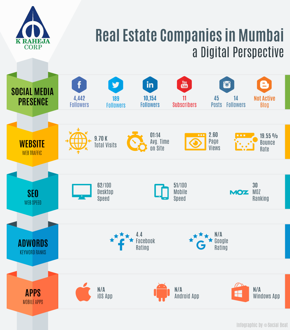
K Raheja is one of the most trusted real estate developers in Mumbai and the Indian subcontinent. From residences to workplaces, hotels to retail destinations, they have made a meaningful impact on the evolution of modern-day living.
UX Audit:
They have a Minimalistic home page with user engagement focussed to the menu. Explore our Projects feature introduces users to all the brands, where each brand project page comes with details of the project and enquiry provision. Their website is not mobile friendly because the text is too small to read and the content is wider than the screen.
Key Features:
Web Insights:
Total Visits |
Avg. Time on Site |
Page Views |
Bounce Rate |
| 9.70K | 00:01:14 | 2.60 | 19.55% |
Moz rank: They have a Moz rank 30 for Domain Authority.
Website Speed:
Twitter: They have only 180+ followers, and they have good quality tweets with no engagement. If they promote their tweets, they can get results.
Facebook: They have 4500 followers on Facebook. They are consistently posting 6 to 7 contents per week all are organic, so they are getting low responses and engagements. Below is an interesting post with not much engagement.
LinkedIn: They are not active on LinkedIn but have around 10000 followers and they haven’t posted anything till now.
Youtube: They are not active on Youtube and have only 11 Subscribers, and their last upload was a year ago.
Google+: They do one post a week in Google+ but still they have only 8 followers.
Instagram: They have only 8 followers in Instagram.
Content Marketing: They don’t have a company blog.
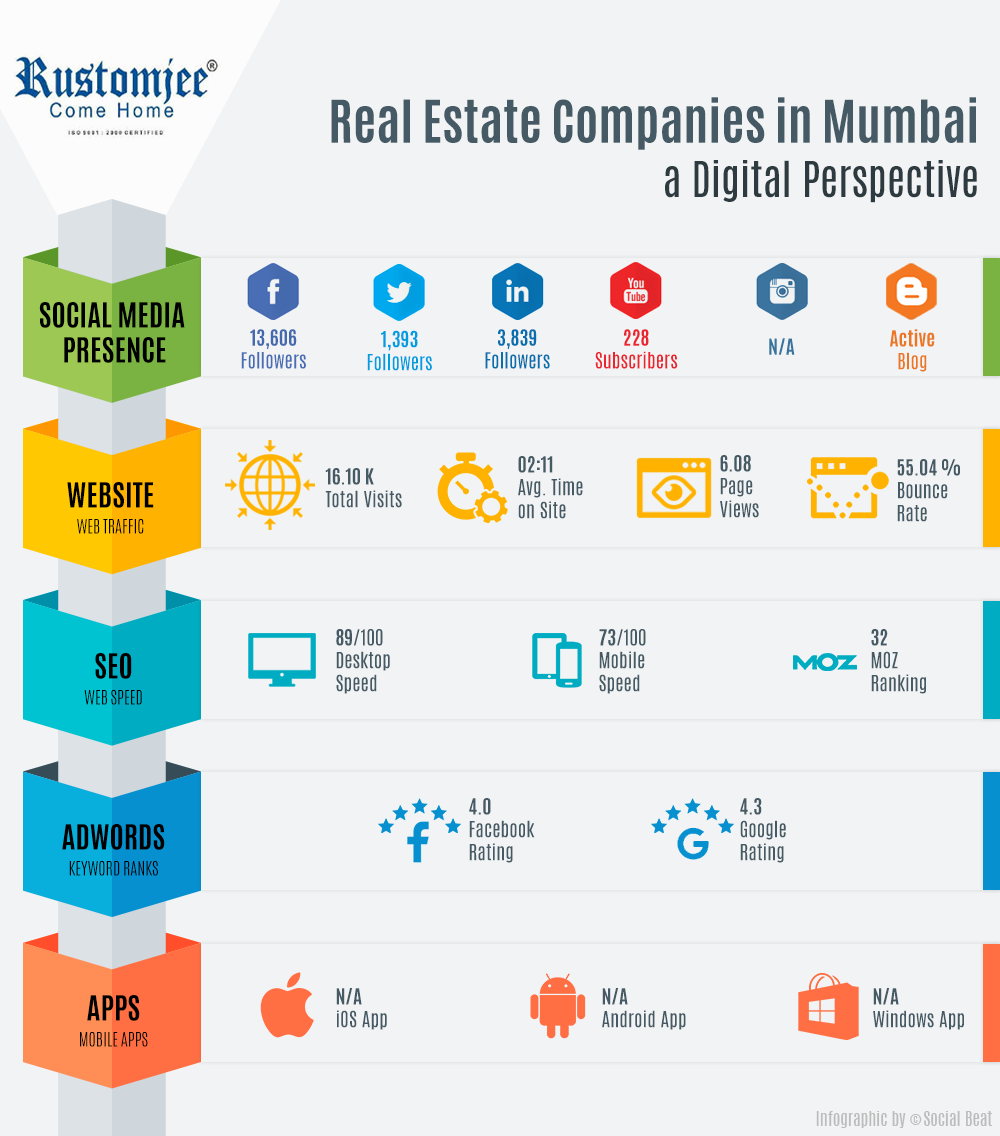
Rustomjee Spaces have transformed 10 million square feet of the city into premium townships, corporate parks, retail spaces, and 8,500+ homes with a special focus on Mumbai Metropolitan Region.
UX Audit:
The web page has a simple banner with prominent CTA and Project locator. There is a showcase of featured properties, and they do have an enquiry form. Project Explorer has filters that would help the user to find properties easily and closer to their choice and their website is mobile friendly.
Key Features:
Web Insights:
| Total Visits | Avg. Time on Site | Page Views | Bounce Rate |
| 16.10K | 00:02:11 | 6.08 | 55.04% |
Moz rank: They have a Moz rank 32 for Domain Authority.
Website Speed:
Twitter: They are active having 1400 followers on Twitter, and they have been consistently tweeting 6 to 9 tweets per week. They have no promoted tweets so there is only little responses. Below is an interesting tweet with little engagement.
Facebook: They have around 13000 followers posting 5 to 6 times per week with little response. All their posts are organic. They might get good engagements if they boost their quality posts.
LinkedIn: They aren’t active past 3 months, but they have decent engagements in their previous posts.
Youtube: They have 220+ subscribers, and they are uploading 3 to 4 videos per month. They have decent views. All the videos are real estate Industry related.
Google+: They are not active on Google+ for the past 2 years.
Instagram: They do not have an Instagram account.
Content Marketing: They are maintaining 2 blogs and have been posting their project related and educative articles at least once per month.
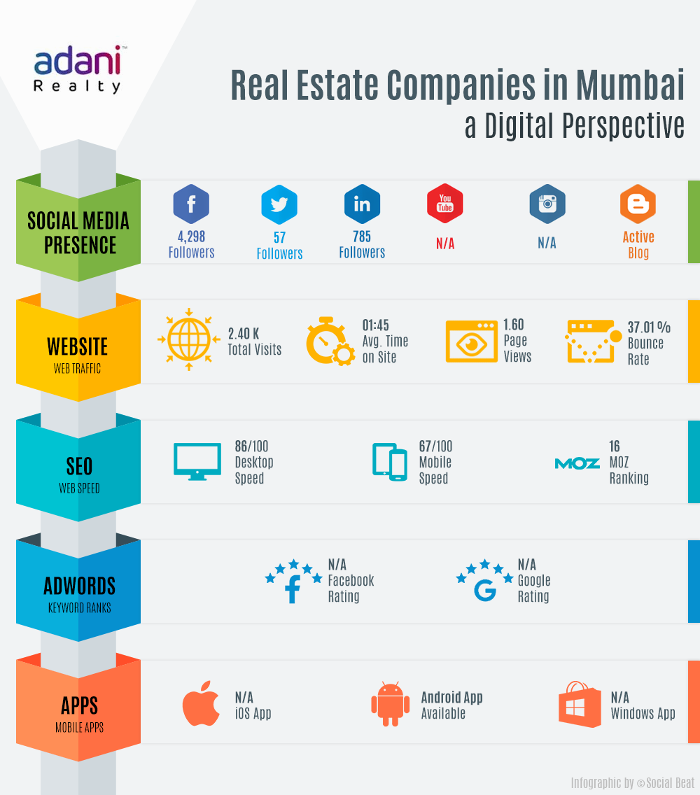
Adani Realty has been developing residential, commercial and social club projects across Ahmedabad, Mumbai, Gurgaon, Kochi & Mundra.
UX Audit:
Their web page has an interesting single scroll homepage design, which focuses on two utilities - one showcasing all their launches and promotions and the other leading the visitor directly to projects/gallery/other information via the menu. Elegant project showcase with the project overview and CTA's leading to individual project websites are some of the noteworthy features.
Key Features:
Web Insights:
| Total Visits | Avg. Time on Site | Page Views | Bounce Rate |
| 2.40K | 00:01:45 | 1.6 | 37.01% |
Moz rank: They have a Moz rank 16 for Domain Authority.
Website Speed:
Twitter: They have 50+ Followers in Twitter and are moderately active. They do 4 tweets per month. Below is an interesting post having low engagement.
Facebook: They are active in Facebook having around 4k followers, and they do at least one post per day and have boosted a contest campaign, which had a good response
LinkedIn: They have 785+ followers and are not that active. They do 4 posts per month and the engagement is low.
Youtube: They don’t have a Youtube channel.
Google+: They are not active in Google+
Instagram: They are not active on Instagram
Content Marketing: They have an active blog in their website itself, and there are around 300 articles.
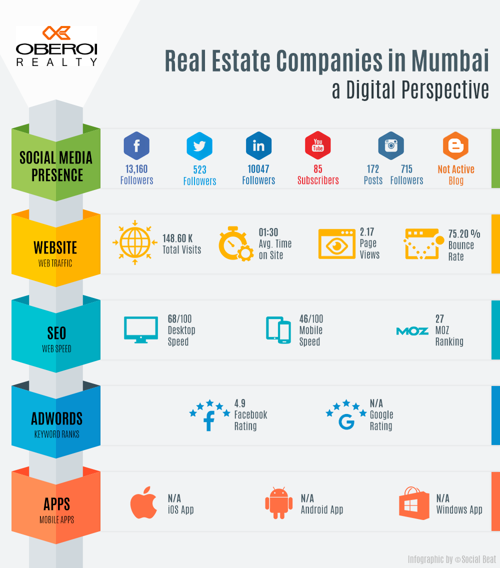
Oberoi Realty has developed over 39 projects at strategic locations across the Mumbai skyline. Over the past three decades, they have been consistently providing high-design and quality residential, commercial, and retail spaces.
UX Audit:
The banners and featured projects provide prominent information to the audience coming to their site. Individual project pages are organized state/city wise to make the navigation easier for the users. Schedule a visit is a useful provision for interested buyers/investors.
Key Features:
Web Insights:
| Total Visits | Avg. Time on Site | Page Views | Bounce Rate |
| 148.60K | 00:01:30 | 2.17 | 75.20% |
Moz rank: They have a Moz rank 27 for Domain Authority.
Website Speed:
Twitter: They are moderately active having only 50+ followers, and they do 2 to 3 tweets per day mostly about their ongoing projects.
Facebook: They are active on Facebook with around 13000 followers posting 3 to 4 times a week. Their posts are organic and have decent engagements. Below is an interesting post about their project.
LinkedIn: They are moderately active with around 10000 followers. They do post 3 to 4 times per month, and the posts are engaging with good responses.
Youtube: They are not active this month but have 80+ subscribers. They have many testimonial videos which are having a good number of views and response.
Google+: They are not active on Google+.
Instagram: They are highly active on Instagram having 700+ followers.
Content Marketing: They don’t have a company blog.
There is no doubt that the best real estate marketing companies in Mumbai are on the lookout to help leading real estate developers leverage the power of going digital. Make sure you read through our blog on Digital Marketing by Real Estate Developers in Bangalore and our detailed Case Study of How a Real Estate Company grew via Digital Marketing for better insights.
You can also check out our blog on how Casagrand generated a record 190 crores in revenue via Facebook for a detailed understanding of digital marketing for real estate.
Digital technology has taken the world by storm. The labyrinth nature of the Internet has engulfed us with a blanket of convenience, making the world a much smaller place to live in. From booking a cab to ordering pizza, we have been spoilt for choice with the number of apps available in the market. Ever since the concept of applications was invented, these tiny widgets have evolved from the phone and tabs to laptops and even smart TVs.
In the past few years, there has been a drastic increase in the number of apps; however, the number of active app users have remained stagnant. According to a study, the average mobile app retention rate is just 20% after 90 days. Even if they have stayed on and not deleted the app, on an average, more than 75% of users fail to return the day after first use. These figures make us wonder – are mobile apps close to extinction?
While some of the essentials apps such as Whatsapp and Facebook will remain an active app on the phone, the rest of them will predominantly disappear. So, what is the future?
Progressive Web Apps – The future of apps
The newest trend observed on the Internet is the emergence of websites with app-like behaviour in a browser. A shortcut to these websites can then directly be added to your device home screen based on how frequently you visit them. The progressive functions of these app-like websites have coined the term Progressive Web Apps, which is the next big thing in the effervescent digital world.
Apart from the plethora of advantages an app user faces, a progressive web app can widely benefit any brand or organization. Gone are the days when websites were merely developed for desktop usage and apps for mobile phones. Considering the fact that most of the organic traffic comes through mobile, it is now mandatory for organisations to take their digital game up a notch to cater to their target audiences. A PWA fills in the gap between an app and a website and is the perfect solution for increased sales or leads.
Furthermore, the cutting-edge application shell architecture used in progressive web apps makes it ideal for e-commerce websites. It eradicates the need to download the app and provides the user with the added benefits of higher page loading speed and enhanced performance in places of limited connectivity.
A lot of leading organisations have already incorporated the concept of Progressive Web Apps in their digital space. Flipkart and Ola are few of the early adopters of this technology. So, its time for mobile apps to move on and welcome PWAs.
If you are running a business online, you should know by now that generating leads is everything. Lead generation is the single most important aspect of digital marketing that helps your business grow.
If you are looking to capture more targeted leads through digital media, one of the main things that you would need is a well optimised, highly targeted landing page. Still not convinced? Here’s an example!
Conversion Rate Experts, world's leading agency for conversion rate optimisation (CRO), helped Moz, then SEOmoz, generate $1,000,000 million with just one landing page that had an alluring call to action. What's more? This revenue was generated by the fantastic landing page and few emails within four months.
You can read the complete case study here.
One of the takeaways from the above case study is that improved user experience helps in lead generation.
So, are you looking to improve the user experience of your landing pages and, in turn, increase your lead generation? Read on!
Designing and managing the perfect landing page
Consider your landing page as a system that will convince your page visitors to become your customers. A well-designed landing page, by itself, can help increase lead generation and conversion. Here are some tips to create an appealing landing page.
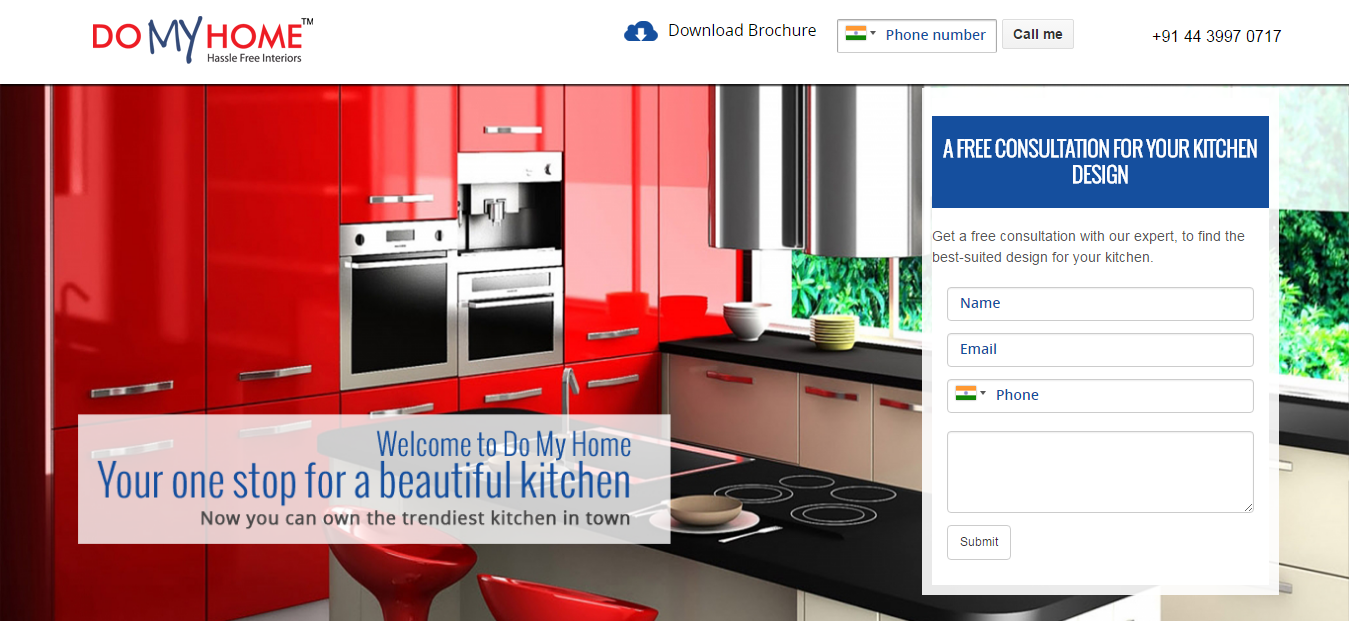
Instead of a typical headline, which screams "buy me," use an enchanting headline that would garner your visitors' attention.
For example, a landing page headline like this – Your One Stop for a Beautiful Kitchen – would interest the visitors a lot more than headlines that talk only about selling.
This is easier said than done. How can you possibly understand someone whom you hardly know? However, understanding your prospective audience and designing the page keeping them in mind is absolutely necessary.
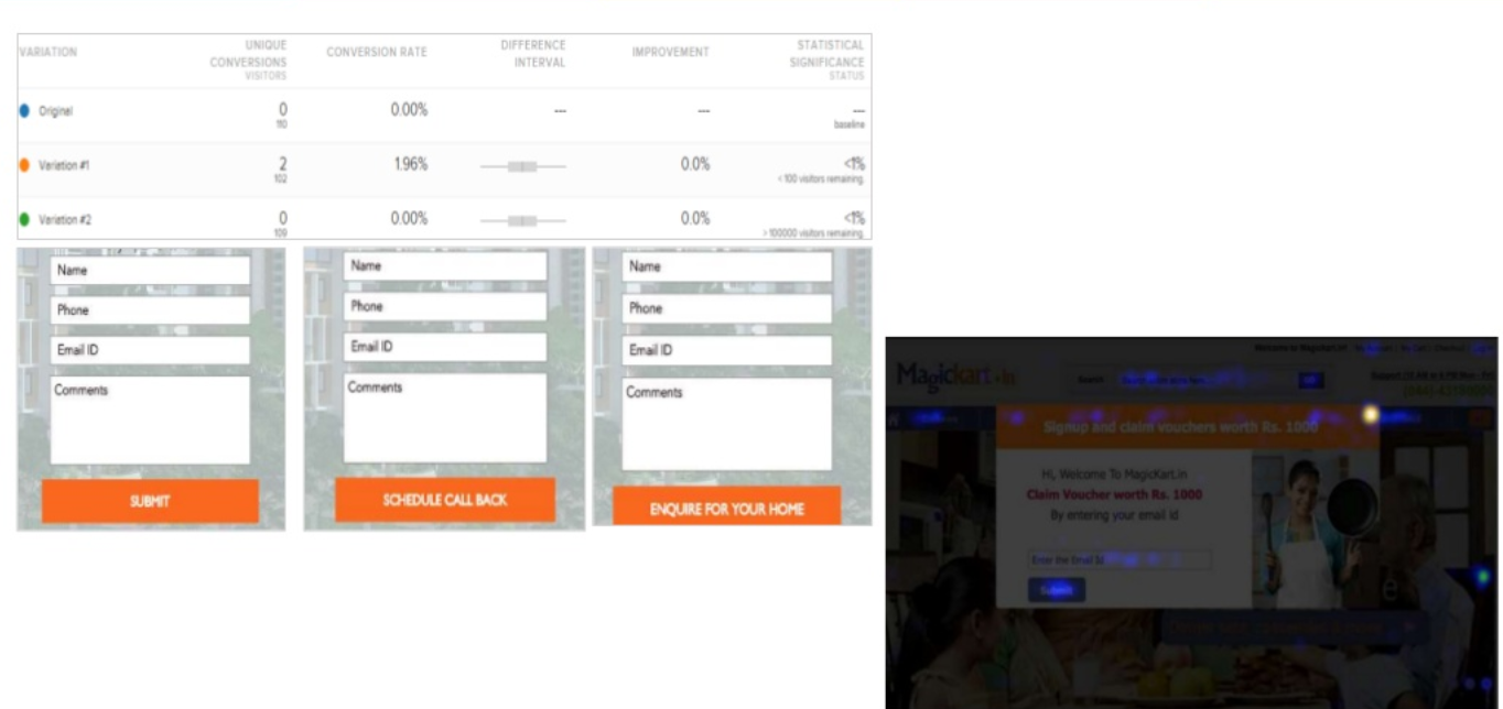
In terms of design, a good idea would be to have a quick A/B testing done and experiment with heat maps on your site. Analyse the results and rework on the design perspective if necessary.
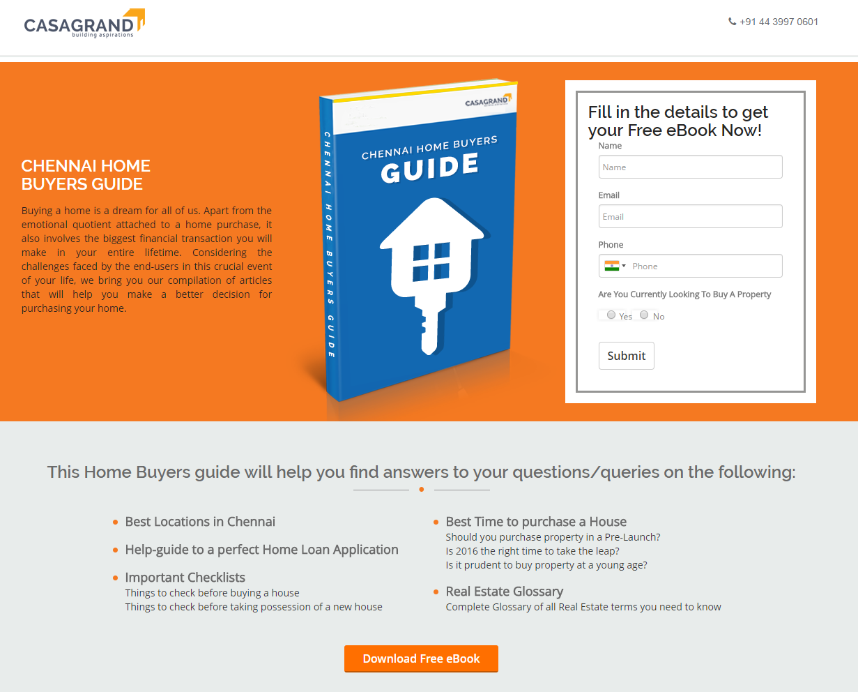
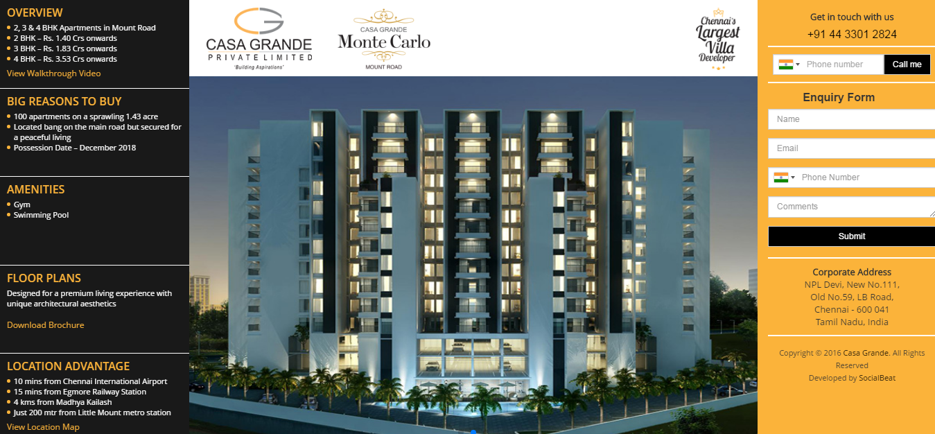
If you are creating a landing page to get your visitors to download your content, one way to do that is to research on what people are searching for in your domain and offer them that. Keeping the target audience in mind, we built a landing page for one of our esteemed clients, Casagrand. Casagrand is one of Chennai’s leading real estate developers with premium projects completed in and around the city. Since their target audience mainly consisted of potential home buyers, we created a handy e-book titled, “Chennai Home Buyers Guide” which consisted of useful tips and suggestions to make the process of buying a home easy and hassle-free. We created a landing page in which visitors had to fill in their details for a free copy of the e-book. This strategy was a win-win for both the customers and our client as the customers walked away with a detailed e-book on buying a home and Casagrand just got a lead of a potential home buyer who is looking for projects to invest in.
You might be tempted to put all the information you have on the landing page. However, you must understand that the landing page design has only one purpose to serve - to get users to click on your call-to-action (CTA).
When you overload the page with too much information, it might have an adverse effect as it might become daunting to someone reading it for the first time. Understand that most users are going to read your landing page content and see the design for the first time. They must be able to grab the information they are looking for from the website. That’s when they will become potential customers for your business.
Furthermore, highlight the major benefits of your service or product on the landing page in a significant and striking manner. This will appeal to visitors and persuade them to become your customers.
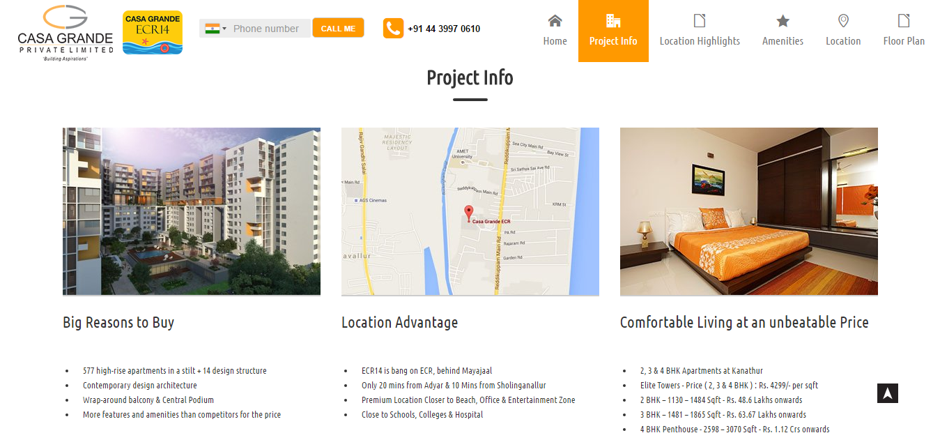
Here’s an example of a landing page that is to the point.
This landing page scrolls through six sections with each section describing information that users would like to know. In the image shown above, the section project info has listed all the efficient and important project information in the form of bullets; this would be easy for people to read and understand quickly.
To accomplish a task efficiently, you must use the right tool. As the good old saying goes, “You can use a screwdriver to pound in nails, but it's a lot harder.” You don’t have to do it the hard way always. Understand that sometimes the right way can be easy too.
There are lots of simple landing page creation tools out there, and each one is unique. You must analyse and pick the right tools for you. Some of the tools that we recommend are:
Instapage – it’s a simple, hassle-free landing page tool. It’s a drag-and-drop software tool that has a lot of professional web design templates.
Unbounce – This is another drag-and-drop software tool. It’s quite simple and recommended for beginners.
LeadPages – One of the most well-known landing page creator tools available online is LeadPages. Most top bloggers and businesses use this tool.
“A picture is worth a thousand words” – This good old saying holds good, especially while creating high-converting landing pages.
Imagine reading the below-mentioned blog page with zero visuals! Tough, isn't it? Even a blog needs images and other forms of visual support, so landing pages must definitely be visually intense.
It is always a good idea to use images, videos, 360-degree photos/videos, infographics, maps, etc. Visuals help users to understand your page quicker. Additionally, having an image or video on your landing page leaves a more enduring impression on users’ minds than written content. Check out our blog on the type of content your target audience will find engaging for a detailed understanding of how content marketing can make your brand trend.
Another visual element that matters a lot is the font that you use; use fonts that are catchy and don’t come across as too overpowering.
If you think that you can simply use some opt-in or CTA form and gain leads, you are absolutely wrong. The type of information you put in your CTA form and the way you design it play a major role in increasing conversions. For example, instead of simply asking someone to sign up to your page, you can ask them to sign up to get newsletters or sign up to get daily tips. Also, captions like “connect with us for…” may work well in increasing sign-ups and conversions.
Using real-time customer testimonials is a great way to increase the credibility of your business. Reviews by customers will definitely create a positive image about your business to first-time visitors of your page, and this might, in turn, help in converting them into your customers. It's a proven fact that customer testimonials improve sales. This option could be left out, for the time being, if you are a new business.
Last but not the least, following up with your leads or subscribers is important. Once you have designed a landing page by keeping all these aspects in your mind, you can definitely expect quite a significant number of leads generated from the landing page. Once that happens, the next step is to convert your subscribers into customers. One way of doing that is to call them up on the numbers provided and talk to them about your business. A subtle way is to send them emails.
However, while sending emails, you must not restrict to sending promotional emails or regular newsletters. Alternatively, it is advisable to send your subscribers a series of crafted emails that will appeal to them. At times, include details about deals and offers, but don't make this a practice. For more insights, check out our blog on the different ways email marketing can work for you.
Never be afraid of sending more emails. However, refrain yourself from sending emails that follow a standard template. The more you send personalised or crafty emails, the more are the chances of converting your subscribers into customers.
Managing your business and marketing it digitally consumes equal, or at times, even more, time, money, and energy when compared to its traditional counterpart. By creating an influential and captivating landing page, you are investing in a driving force to convert your visitors to potential clients.
There is no doubt that digital technology has engulfed our world with a blanket of convenience. There is an app in our phones for literally every day-to-day activity, from booking a cab to ordering pizza. However, the lack of storage space and increased consumption of mobile data and time has led to stagnation in the number of app-users worldwide.
To address this issue, websites are now being re-designed with app-like behaviour. Frequent visits to these websites will lead to a pop-up in your phone prompting you to add a direct shortcut to the website in your main menu. The progressive functions of these app-like websites have led to the emergence of Progressive Web Apps (PWAs). This new technology has taken the digital world by storm and is here to stay. Social Beat is one of the few digital marketing agencies who has incorporated this technology in our website. Following is an article from Times of India in which Vikas Chawla, our co-founder, has given us a closer insight into the benefits of Progressive Web Apps and their impact on the consumers.
So you’ve developed a mobile app, excellent, but what next?
There are more than 4 million apps in the Google Play Store and Apple App Store and this number will only increase with the coming years. While each app is exclusive to the developer, only a few get the deserved recognition from users. To be precise, the fate of your app after its development depends on how many users download and use it. According to research, 63% of apps are discovered through app store searches, so it is highly essential to optimize your app for the app store.
Here are some best practices to get more app downloads and to increase your rankings in the app store.
No, naming your app after you or your business won't work well. A good idea would be to choose two to three keywords and using at least one of them in the title of your app. According to data, apps with keywords in the title rank 10.3 per cent higher than those without a keyword in the title. This way, your app will show easily in the search results. However, make sure that you don't make the app name look like a spam by overstuffing keywords. The title needs to be short because that’s what users can read in a single screen. Obviously, you don’t want your title to get cut. Titles are usually cut after the 23rd character (including spaces) in the App Store and the 30th character in Google Play. The first thing that the users see about your app is the name and icon. This is the first and the best chance to impress your users. Therefore, be cautious and creative when thinking of a name for your app.
Most of the times, users may need an app for some particular function, but they may not be sure which, app to download for the same. In such cases, the description option in the app store comes in handy. Reading the description of the app will help the users know what your app does, and it will also decrease the chances of uninstalls as the users know about the app well before downloading it.
Make sure the description is precise and concise and brings out what the app does exactly. Use bullet points wherever required and avoid dense paragraphs.
Also, read our blog on "10 Free Apps for Productivity, Social Media & SEO.”
As we said before, an app icon and the app’s name are the ones that catch your users’ eyes easily. Make sure that your app’s icon is designed from scratch. Also, do not make it too elaborate or complicated. Keep it simple, unique, and attractive and make sure the icon breaks through the clutter. Do remember that the play store and the App Store have both varying standards in terms of size, geometry, and color scheme of app icons, so design the icons accordingly. The iOS icons should be sized to at least 1024×1024 pixels and the Google Play requires a 512×512 icon.
Have you noticed those screenshots that are shown in the app store when you check out an app? Well, that’s your next chance to capture the attention of your potential app users. To make a visitor download your app, you must place screenshots tactfully in this section. You can upload up to five screenshots for an iOS app and eight for an Android one, however, only two or three screenshots will appear in the gallery when the page loads. Only use screenshots that will differentiate your app from other similar apps. For the best results, you could A/B test various screenshots to see, which drives the most downloads. Read our blog on “How Design Can Help Tell a Brand Story.”
Like any other software, your mobile apps will also need regular updates and upgrades. If you launch your app and forget it, your users will download it and forget or uninstall it. Release periodical updates with relevant release notes explaining what’s new in the update.
You don’t have to urge them to review or rate you with pop-ups every other minute, but gently nudge your users to rate your app. This will always help in increasing your views. Furthermore, do not ignore negative reviews, but pay attention to what was wrong in the users’ experience and try to fix it. The apps with high ratings are all ones that keep their audience engaged and take customer feedback positively. You can also make use of influencer marketing to get your app reviewed by top digital influencers.
If your app is something that needs to be bought, set a competitive pricing. Instead of making your app more expensive than other similar apps, set a nominal price and improvise on making your app the best in the category. If your app is free, then add it to the in-app purchases category to improve its listing and visibility.
When your app is available in various languages and is compatible with different OS versions, it is bound to get more view and reach than an app released only for one OS and in English. Both the iOS and the Play store allow you to localize your listings to make discovering your app easier for customers in other countries.
We hope by now you have understood the various best practices that must be followed to improve your app download. Comment below some of the other tips that you would like to add to our app store optimisation cheat sheet.
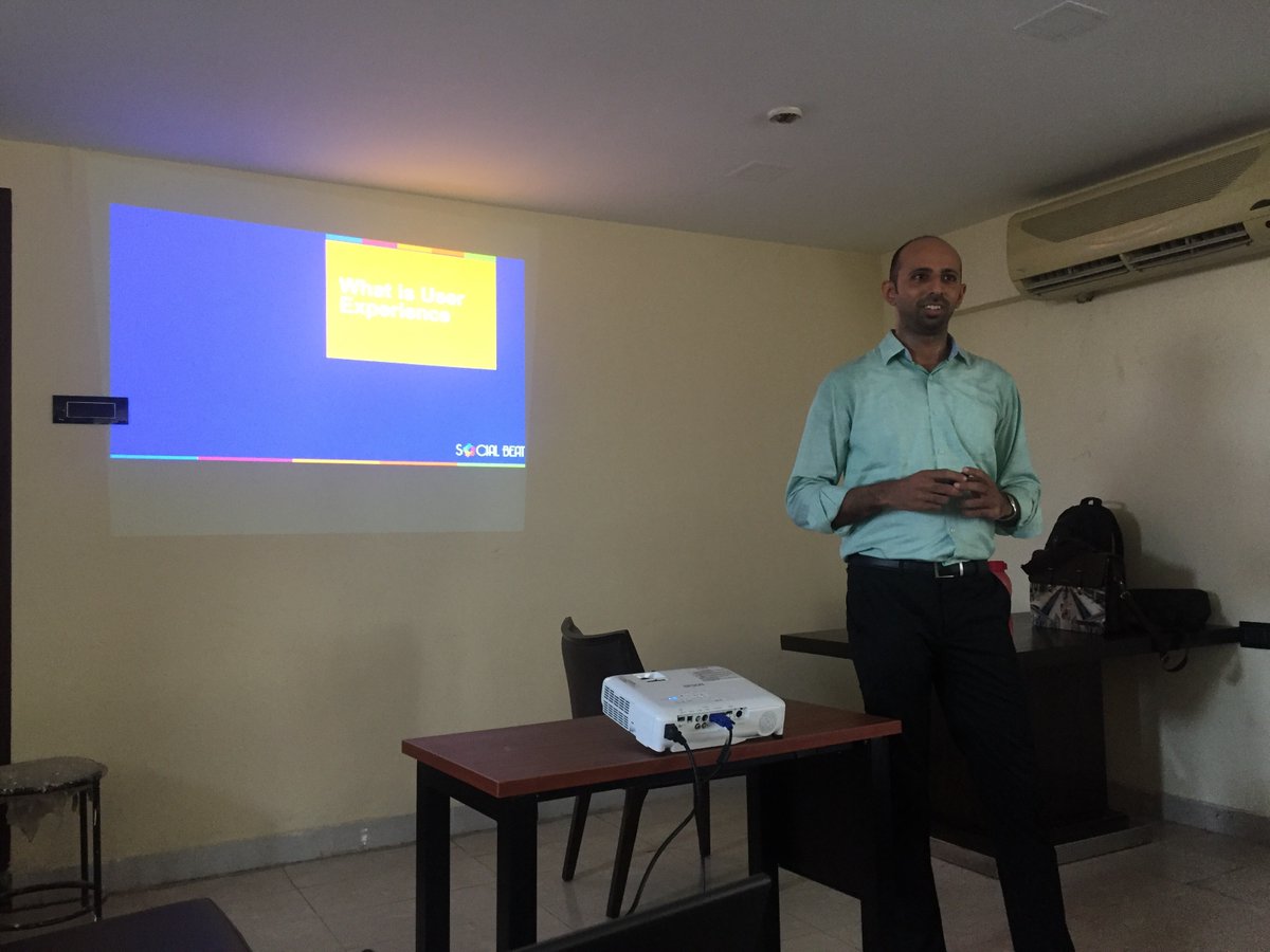
The seventh edition of the Digital Chai Pe Charcha was held in Workafella, one of the best business centres in Chennai on 8th October, 2016. The event saw over 25 participants who were a mix of entrepreneurs, digital marketers, and professionals. User Experience, an important element in any website or app these days, the entire session was insightful, engaging and very informative!
UX or User Experience is exactly what the name suggests – the overall experience one has when they land on your website or your app and the interaction with the company, its services, and its products throughout. In short, the way a website or an app works plus the look and feel of it all together making your user want to come back to your site.
Benefits of good UX –
Research shows that the overall experience of a user right from landing on your site, navigating and scanning through your pages till moving out of your site to another, the emotions that the user feels throughout – satisfied or unhappy – plays a major role on how your brand performs online in comparison to your competitors.
It helps in converting a user into a potential customer and not just that – but converting them at a low cost.
Do a quick study on who your competitors are and analyze their digital mediums. Understand what they do to provide their users with a great experience on their site. Work on your content, have collaborative discussions and put down the necessary inputs to go on your site.
Have a good idea on the different elements you would like to add on to your site – be it a revised sitemap or navigation flowcharts by analyzing user personas and scenarios.
Work on your website with a neat and clear wireframe that should include digital touch-points further building the virality loop.
After your new website is ready to launch, have a quick A/B testing and experiment with heat maps on your site. Analyze the results and rework on the design perspective if necessary.
The speed at which a new user navigates on your site, understands your business and moves through different pages says a lot about the flow of your site.
The user needs to have a smooth experience while navigating through your site, moving from page to page and gathering all the information required.
If your site has a landing page with a form, make sure the form is simple with limited fields keeping in mind to not ask for information that is too personal to the user or fields that will require the user to go back and forth too many times.
Your user’s information should remain confidential and should not be hampered with.
How good is your site’s layout and balance? Is there a consistency in the font? Are the clickable items clear to the user and is the entire page pleasant and easy to navigate?
UX can be improvised with the help of some efficient tools. To improve the overall look and feel of your site, make use of customer surveys, user interviews and case studies. To track your customers’ behavior on your site, experiment with Zarget, Inspectlet, CrazyEgg, Optimizely, Google Analytics and MouseFlow. To understand prototyping, try Balsamiq, Axure, Invision and Pen & Paper.
When the site’s design and flow is focused on establishing a good user experience, the bond between the company and your customer grows building the brand as well as the overall experience of the user with the company.
Click here to understand more on how UX Can Make or Break Your Business
Those of you who missed the first six editions of the Digital Chai Pe Charcha can check them out below:
The principle of User Experience has not changed in the past few decades; our approach to UX, on the other hand, is constantly evolving. User experience is the means, not the end to a problem; the process is never ending. The art of balancing user needs and brand message is an important element. We already have many trends rolling out in pace with the technology, and it all boils down to knowing what to use when.
In the race to catch up with the latest trends and continuing to do what exists, we forget the most important aspect – users. It sounds like UX 101, but this is where many designs lose vision. We forget to find out what the users need and instead assume what they want. As a result, most websites look alike and most experiences feel the same. One may argue that it is efficient and gets the job done. I agree, but what you haven’t tried out may get greater results. Grab the better one, always.
Do you really need a compulsory registration, does your customer have to go through 5 pages before buying a product, and does that information about the company founders on the home page help in any way? Your average user probably does not. The definitive answers to these can be found with some user research, but it’s important to ask these questions. One such case in point was when we designed a simple, no-scroll landing page for a real-estate client. The users had only the most important information presented to them without the frills. The main CTA on the mobile version was a callback feature, which encouraged users to drop just their numbers, without giving out much personal information in an enquiry form.
Rather than add a feature because the competitors do it or because it helps with ROI, we need to achieve the same without turning off the user. Find creative ways to add new dimensions to the user journey, a perspective for every type of user.
With technology advancing each day and the number of devices multiplying, we have a greater challenge to cater to every member of the community. Crafting experiences that are inclusive to all can be a challenge, and the key to achieve that is by understanding that there is no single approach to every problem.
There are plenty of avenues to bring in more users, increase conversions and make more money for the clients. The need of the hour for many businesses is to take it further and this is where UX fits in nicely. Instead of concentrating on what the majority of the customer base is thinking; we need to start looking at what the minority wants. In many mobile versions of our websites, we come across devices that are used by less than 15% of the users but we have ensured that they have a similar experience of browsing as the rest. Customizing to each device size is a little work, but it yields good results in the long run. Begin by understanding how the bottom 20% of the users behave and find ways to enhance the experience for them. Tap into all of your demographics and include the lesser-used browsers; the aim is to have a consistent user experience for all.
Personalization is important; users want to feel that businesses are directly talking to them. A good design gives them that without compromising on brand message and end-goal.
The last few years saw design minimalism in websites and apps – hamburger menus, single color & typeface, flat icons and hidden sections (the footer especially). This approach clearly works because the style is simple without distracting the user. It is a linear thought process, taking the users from Point A to Point B without making them think about anything else.
While minimalism will be around for a long time, it needs to be handled without being overdone. In the name of de-cluttering many websites and apps have dumbed down their journey so much that users feel powerless. No one likes to be told what to do and it is something that we should avoid. It is crucial to let the users decide how they want to fulfill their needs; the job of user experience is to ensure that the process is coherent and seamless. Gently push, don’t shove.
It can be as simple as having more options during the checkout process – can the customer continue as a guest user, can the customer login through any of social media accounts instead of a compulsory registration or Gmail signup? Test different options to see what works for your business and implement them in the longer run.
We are surrounded by best practices and latest trends that come out every week. They are good to implement but don’t get too caught up in them, always ask if it’s the right one for your user base. We need interfaces that are efficient & data-driven, not just what is in. Create memorable experiences that would bring a user back and make them remember you for a long time.