It is safe to say that the user experience offered by the digital assets of a brand either makes or breaks its online image. The exponential growth of mobile users in the past few years has made it imperative for companies to up their game while engaging with the next billion internet users. This need gave rise to Accelerated Mobile Pages (AMP) for faster and easy access to mobile-responsive pages. However, Google has now introduced the “Swipe to Visit” option for AMP-enabled sites to seamlessly direct users to your website from an image search. Here’s all you need to know about this recent update.
Say, you search for an image in Google. Once you key in your inputs, you land on the result page showing multiple images pertaining to your search. Now, when you click on a particular image, it enlarges and suggests related images in the bottom. However, with the new update, there is a preview of the AMP-enabled website in the footer of the image search page. Users can swipe up the preview option to quickly view the corresponding web page that contains the original image listed in the search results. While reading the AMP article, in case you want to get back to the image search result page, all you have to do is to swipe down.
Recent data shows that nearly 63 percent of users performing image searches on Google, click on the image to visit the source website. Leveraging the Swipe to Visit option will now enhance user experience, which, in turn, will help in improving organic traffic to the website. This provides a chance for brand awareness and will lead to the domino effect of increased time spent on the website, due to the high-quality content available to consume. Hence, it is crucial for the website to load quickly and be SEO friendly for better results. On the whole, the Swipe to Visit option enhances the conversion rate of the product which is vital for the success of effective digital marketing. To add to that, web pages that are already AMP-enabled need not take an additional effort to update the Swipe to Visit option as it is automatically upgraded.
Although images are not the most common types of search, since a picture speaks a thousand words, your website will receive increased number of clicks due to this convenient option. Therefore, Swipe to Visit is an important break-through to naturally channelise traffic to your website and improve the quality of leads generated.
As dramatic as it may sound, generic home pages are dying. Gone are the days when websites welcomed visitors with the same page whether you are a millennial in South East Asia or a retired businessman in Mexico. Just like how old-school drip marketing is being replaced with customised emailers and native apps are getting substituted by new-age progressive web apps, universal home pages are being upgraded to pages that are personalized as per the demographics of the audience, and nothing in the online space is the same anymore!
Ever since we hopped on to the bandwagon of the Internet, digital marketing has taken over the world of branding and advertising. The ease in which you can showcase your company and literarily reach out to the palms of viewers across the world is unfathomable. Keeping this strategy in mind, why would you want to show the same webpage to all your visitors when each one of them has different needs and expectations from your brand? Let’s take a look at the benefits of personalising your homepage and the different ways in which you can wow your website traffic till you ultimately convert them into loyal consumers.
A tailor-made home page will help in generating premium leads as the page will display what you specifically have to offer for each visitor. Attracting potential clients by showcasing types of content they will find engaging is the basis of digital marketing and personalised web pages do exactly that.
Through customised home pages, brands can welcome their online visitors with a personalised message. This triggers a unique user experience as you add a personal element to your page, assuring viewers that you have already hand-picked your services as per their preferences and requirements.
Personalised homepages also add value to your marketing strategy by widening your global reach. Since you can personalise pages based on the location, you can now easily target consumers with what is trending in that particular locality. This makes the content on the homepage more relatable for the visitor and adds to the possibility of them converting to your brand.
Apart from showcasing the brand and attracting target groups, websites also provide business owners with a plethora of other useful information to understand online traffic. From the location of the viewers and the time of peak traffic to the type of content most-consumed on the website, marketers can observe the patterns of activity and use this to their advantage. Let’s understand this concept better with a hypothetical situation. Consider yourself to be the owner of a B2B organisation which provides end-to-end HR services. A potential client has recently visited your website through a Facebook carousel ad and spent seven minutes going through your HR packages. The next time the individual visits your website, they will either have to manually search for the packages they were interested in or bounce back with a last minute change of mind. However, through a personalised homepage, the visitor will be welcomed with a customised message. This message will showcase the services and packages they had clicked through with an effective CTA to either buy the package or know more about it. The unique user experience will draw the user into your website and boost the lead generation of your B2B organisation.
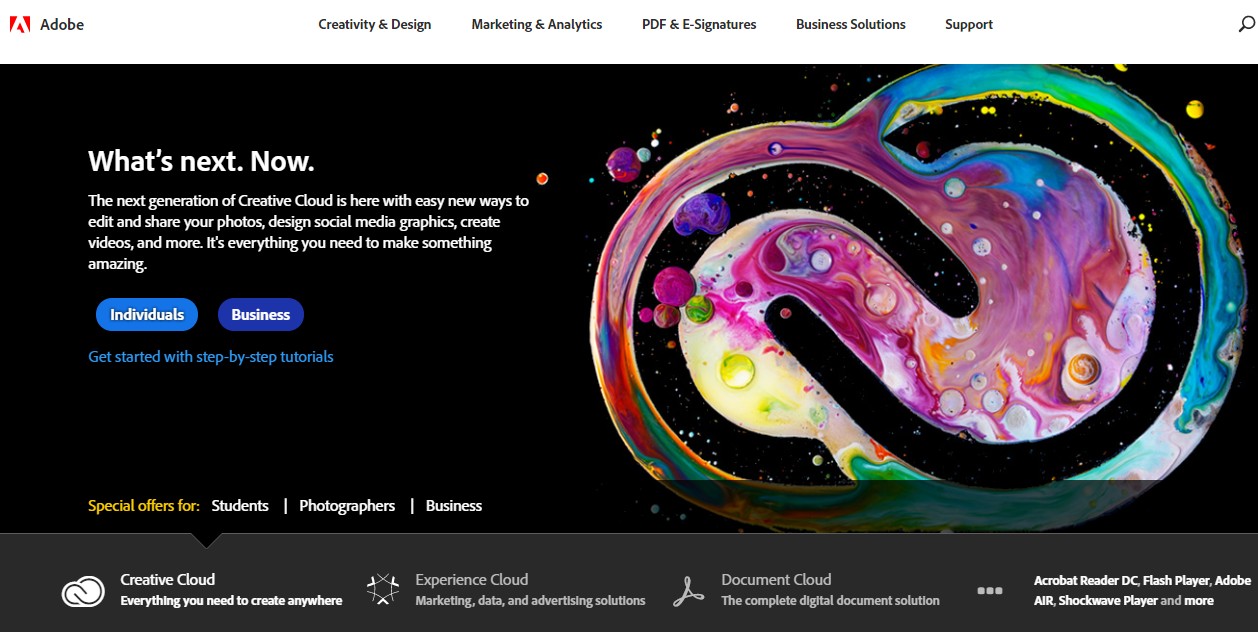
Adobe India is one of the first Indian websites who has upgraded their website with a personalised homepage. Visitors around the world are initially welcomed with a homepage that displays a blurb on their next-gen Creative Cloud segment. There are two CTAs – one for individuals who are interested in the concept and the other one for businesses.
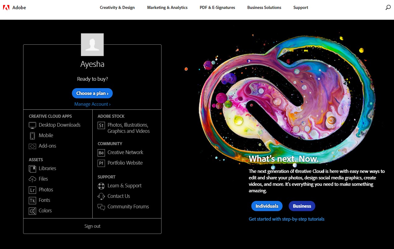
In order to explore the effectiveness of the personalised homepage, we clicked on the “Creativity and Design” tab and ventured into the field of photography by scrolling through the Creative Cloud Photography plan. After spending a good ten minutes on the website and surfing through the various plans available for individuals, businesses, students and universities, we clicked on the Adobe icon in the top left corner to go back to the homepage.
If the Adobe website had a generic homepage, one would expect the same page to show up as discussed above. However, since the website has a personalised home page, we were welcomed with a customised page which helped us continue from where we left. In this case, since we had browsed through the various Creative Cloud Photography plans earlier, we were welcomed with the blurb “Ready to buy?” followed by a CTA which helps us with choosing a plan as per our preferences.
As you can see in the above image, the blurb about the Creative Cloud is still present, but you also have a personalised message on the plans you were interested in earlier.
Personalised home pages work as an excellent marketing strategy for B2C companies and social media platforms as well. In a quest to provide consumers with what they are searching for, personalised home pages read the IP address of the visitors and categorise them as per the location. The visitors are then welcomed with topics and concepts that are trending in their locality or that are the most searched for in the region.
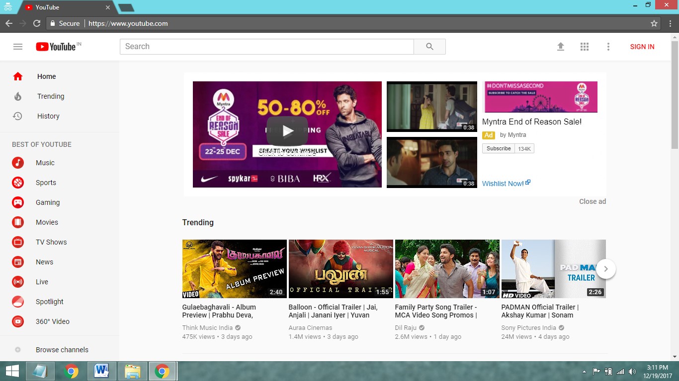
Let’s take the example of Youtube to understand this theory better. Youtube has personalised their homepage as per the location of the visitors and showcases all the trending videos in the region.
As you can see in the image above, Youtube viewers in India are welcomed with a series of trending videos that include snippets from the regional entertainment industry. The ads on the page are also targeted to the audience based on the location of the guest.
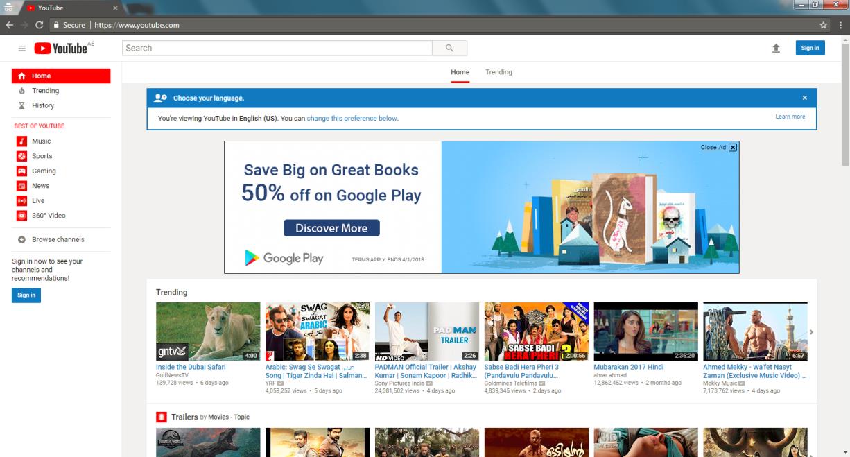
The image above is the same homepage viewed from Dubai. As you can notice, the URL entered is the same, but the content on the page is different. In this homepage, the trending videos are based on the popular activities of the region. They also include videos in Arabic – the regional language of Dubai. Additionally, the advertisements on YouTube are entirely different from the ones displayed on the homepage when viewed from India.
Big names in the digital space like Adobe and Youtube are already leveraging the benefits offered by the adaptive nature of personalised homepages. But, what about small-scale businesses and start-ups? The best part about this new-age concept is that you can personalise your homepage one step at a time. It is not a go-big-or-go-home kind of situation.
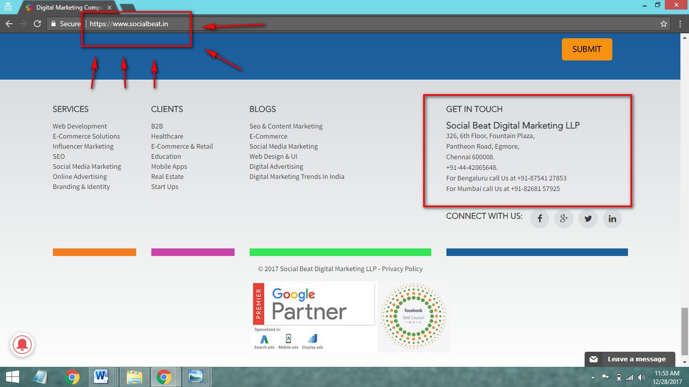
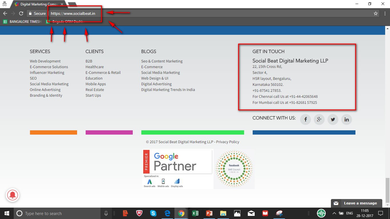
For example, we, at Social Beat, recently explored the idea of personalised home pages by customising our website as per location. With our headquarters in Chennai and regional offices at Mumbai and Bangalore, we decided to start by customising the address in the “Get in touch” tab as per the location the visitor is at.
As seen above, if you visit our homepage from Chennai, the “Get in touch” tab in the footer will display our Chennai address.
The same homepage displays the Bangalore address when you log in from Bangalore.
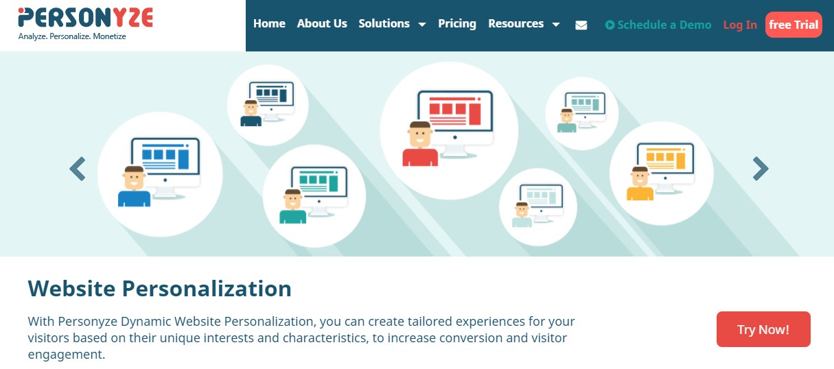
There are a wide range of tools available out there to personalise your homepage based on a multitude of integrations like Google Analytics, Hubspot and Wordpress. Let’s take a look at a few of them.
With this tool, your homepage will be personalised based on a variety of factors such as geographic location, data from their social media profile and CRM information, to name a few. You can also opt for a free trial or schedule a demo as per your preferences.
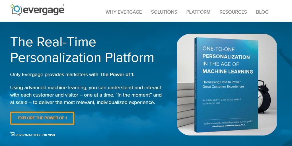
Evergage focuses on enhancing visitor engagement by providing them with a tailor-made user experience. Visitors are welcomed with more relevant offers and appropriate content which is guaranteed to help in lead conversions and customer success stories.
Apart from these tools, you can also check out Bound, Convert and Optimizely that are brilliant in examining your traffic and providing visitors with unmatched customer experience.
Now that you have a better idea about personalised homepages and the vital role they play in visitor engagement and lead generation, its time you upgrade your company’s website with this ground-breaking technology and stay ahead in the ever-lasting race of digital marketing.
Contact us at Social Beat and leverage the multitude of benefits a personalised homepage can bring to your business.
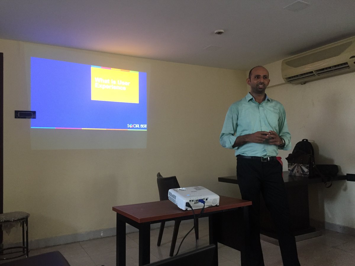
The seventh edition of the Digital Chai Pe Charcha was held in Workafella, one of the best business centres in Chennai on 8th October, 2016. The event saw over 25 participants who were a mix of entrepreneurs, digital marketers, and professionals. User Experience, an important element in any website or app these days, the entire session was insightful, engaging and very informative!
UX or User Experience is exactly what the name suggests – the overall experience one has when they land on your website or your app and the interaction with the company, its services, and its products throughout. In short, the way a website or an app works plus the look and feel of it all together making your user want to come back to your site.
Benefits of good UX –
Research shows that the overall experience of a user right from landing on your site, navigating and scanning through your pages till moving out of your site to another, the emotions that the user feels throughout – satisfied or unhappy – plays a major role on how your brand performs online in comparison to your competitors.
It helps in converting a user into a potential customer and not just that – but converting them at a low cost.
Do a quick study on who your competitors are and analyze their digital mediums. Understand what they do to provide their users with a great experience on their site. Work on your content, have collaborative discussions and put down the necessary inputs to go on your site.
Have a good idea on the different elements you would like to add on to your site – be it a revised sitemap or navigation flowcharts by analyzing user personas and scenarios.
Work on your website with a neat and clear wireframe that should include digital touch-points further building the virality loop.
After your new website is ready to launch, have a quick A/B testing and experiment with heat maps on your site. Analyze the results and rework on the design perspective if necessary.
The speed at which a new user navigates on your site, understands your business and moves through different pages says a lot about the flow of your site.
The user needs to have a smooth experience while navigating through your site, moving from page to page and gathering all the information required.
If your site has a landing page with a form, make sure the form is simple with limited fields keeping in mind to not ask for information that is too personal to the user or fields that will require the user to go back and forth too many times.
Your user’s information should remain confidential and should not be hampered with.
How good is your site’s layout and balance? Is there a consistency in the font? Are the clickable items clear to the user and is the entire page pleasant and easy to navigate?
UX can be improvised with the help of some efficient tools. To improve the overall look and feel of your site, make use of customer surveys, user interviews and case studies. To track your customers’ behavior on your site, experiment with Zarget, Inspectlet, CrazyEgg, Optimizely, Google Analytics and MouseFlow. To understand prototyping, try Balsamiq, Axure, Invision and Pen & Paper.
When the site’s design and flow is focused on establishing a good user experience, the bond between the company and your customer grows building the brand as well as the overall experience of the user with the company.
Click here to understand more on how UX Can Make or Break Your Business
Those of you who missed the first six editions of the Digital Chai Pe Charcha can check them out below:
The principle of User Experience has not changed in the past few decades; our approach to UX, on the other hand, is constantly evolving. User experience is the means, not the end to a problem; the process is never ending. The art of balancing user needs and brand message is an important element. We already have many trends rolling out in pace with the technology, and it all boils down to knowing what to use when.
In the race to catch up with the latest trends and continuing to do what exists, we forget the most important aspect – users. It sounds like UX 101, but this is where many designs lose vision. We forget to find out what the users need and instead assume what they want. As a result, most websites look alike and most experiences feel the same. One may argue that it is efficient and gets the job done. I agree, but what you haven’t tried out may get greater results. Grab the better one, always.
Do you really need a compulsory registration, does your customer have to go through 5 pages before buying a product, and does that information about the company founders on the home page help in any way? Your average user probably does not. The definitive answers to these can be found with some user research, but it’s important to ask these questions. One such case in point was when we designed a simple, no-scroll landing page for a real-estate client. The users had only the most important information presented to them without the frills. The main CTA on the mobile version was a callback feature, which encouraged users to drop just their numbers, without giving out much personal information in an enquiry form.
Rather than add a feature because the competitors do it or because it helps with ROI, we need to achieve the same without turning off the user. Find creative ways to add new dimensions to the user journey, a perspective for every type of user.
With technology advancing each day and the number of devices multiplying, we have a greater challenge to cater to every member of the community. Crafting experiences that are inclusive to all can be a challenge, and the key to achieve that is by understanding that there is no single approach to every problem.
There are plenty of avenues to bring in more users, increase conversions and make more money for the clients. The need of the hour for many businesses is to take it further and this is where UX fits in nicely. Instead of concentrating on what the majority of the customer base is thinking; we need to start looking at what the minority wants. In many mobile versions of our websites, we come across devices that are used by less than 15% of the users but we have ensured that they have a similar experience of browsing as the rest. Customizing to each device size is a little work, but it yields good results in the long run. Begin by understanding how the bottom 20% of the users behave and find ways to enhance the experience for them. Tap into all of your demographics and include the lesser-used browsers; the aim is to have a consistent user experience for all.
Personalization is important; users want to feel that businesses are directly talking to them. A good design gives them that without compromising on brand message and end-goal.
The last few years saw design minimalism in websites and apps – hamburger menus, single color & typeface, flat icons and hidden sections (the footer especially). This approach clearly works because the style is simple without distracting the user. It is a linear thought process, taking the users from Point A to Point B without making them think about anything else.
While minimalism will be around for a long time, it needs to be handled without being overdone. In the name of de-cluttering many websites and apps have dumbed down their journey so much that users feel powerless. No one likes to be told what to do and it is something that we should avoid. It is crucial to let the users decide how they want to fulfill their needs; the job of user experience is to ensure that the process is coherent and seamless. Gently push, don’t shove.
It can be as simple as having more options during the checkout process – can the customer continue as a guest user, can the customer login through any of social media accounts instead of a compulsory registration or Gmail signup? Test different options to see what works for your business and implement them in the longer run.
We are surrounded by best practices and latest trends that come out every week. They are good to implement but don’t get too caught up in them, always ask if it’s the right one for your user base. We need interfaces that are efficient & data-driven, not just what is in. Create memorable experiences that would bring a user back and make them remember you for a long time.
Understanding User experience and its importance
The father of UX - Don Norman defines user experience as a science that encompasses all aspects of the end-user’s interaction with the company, its services and its products. User experience takes more than just defining it. Let's relate it to the real model.
What makes shopping fun? Most of you would say - ‘buying the product’. I agree, but not entirely. Buying the product is the last step of the shopping process. What led to buying is your positive experience at the store, walking down the different sections, stacked with a variety of designs and then finding the perfect take away. Not to forget, the billing experience!
Let us map the real-world model to your online experience on a business website – right from getting to your website through a certain landing page, to reading your content; from navigating the site to finally taking a conversion action, everything counts as user experience.
Research studies on UX and A/B tests on websites have led to pointing out thrust factors that impact the experience of a user on your website.
UX Factors that lead to conversion
Let us see how we can build a good website design below:
1) Product Pitch: The pitch of a website sketches out the business identity. Content that speaks out about how the business goals are intended to benefit their customers, caters positively to the user’s experience. This is the part of experience where tone of the website builds trust and communication with the user. A strong selling pitch can boost your sales.
2) Comfortable and Intuitive navigation:
Comfort and intuitiveness are key factors that lead a user to conversion. Even if you perfectly speak out how good your product is, if a user fails to see the interface as friendly, intuitive and quick - they are likely to bounce.
3) Content & Aesthetics:
Neil Patel says that great content is definitely the reason behind returning visitors and he quickly adds that good content is valuable only when it's readable and engaging. That’s where aesthetics comes in. Content becomes friendlier when the formatting stands out in a way that grip the user's attention. A good use of contrast colors for backgrounds and text can make a piece of content interesting to read; adding images that are crisp and meaningful, makes your content 10x; visual cues using text formatting, colors, icons can guide the user about your site;
Everything that brings about a conversion like important content, call to action, contact information etc. should be made to stand out by using principles of aesthetics.
In addition to SEO, Google algorithm is emphasizing on returning results that have an excellent user experience. So it's important to always look back at how your website is doing from the UX perspective.
Here’s an excellent example to demonstrate how the thrust factors contribute to providing an experience that builds a trust relationship between the customer and the product.
Gehna, a brand that sells stunning unique Indian jewellery have made their online presence valuable by providing a user-friendly platform for online shopping and jewellery customization.
Some of the reasons why Gehna’s landing page User eXperience ticks:
1) The first impact this website makes, is with its aesthetics. Clean layout with enticing images, interesting fonts and color balance, which ultimately leads to a pleasant experience.
2) The content on this page is kept optimum without distractions and has excellent customer value. Studies in cognitive psychology state that a user is prone to action whenever he finds all the necessary information around a CTA. The banner on this page impresses the user by laying out their available services in a dignified way. This is the point which engages the user and leads to conversions.
3) By giving their users an insight into their work, customization process and user testimonials, they have built trust with their prospective customer.
To sum it up, with their unique propositions, well organized content and evident CTA’s, they have provided the customer an impactful experience that bags conversions. I urge you to remember, a great landing page UX leads to the quickest conversions.
If you notice in entirety, it’s the little things that tend to add up in the big way. What demonstrates this is the power of a well-designed form with a proximately placed CTA
Every CTA leads a step closer to conversion. Once a prospective customer decides on a product/business, the only thing in between, is the experience of making it happen. Be it a registration, purchase checkout or a reservation - more often, the last step towards a conversion is completing a web form. UX is indeed impactful here.
To understand this better, let’s take a look at a few insights from conversionXL’s Peep Laja
The key is to ask only for relevant information and skip the research questions. This means that a 5-field form out performs a 9-field form by approximately 30%. Research studies based on usability ROI, has seen that every time a form was simplified, businesses saw huge increases in their conversion rates.
With a great service pitch, an eye-catching image and simple fill-out form, Pamperazi clearly tells you what you’re up to.
UX is so impactful that it can break or make your business revenue
Statistics from experiments conducted by various organizations has shown the tremendous impact that UX has had on sales/revenue. Let us explore a few examples & case studies
Call to Actions
According to Jared M Spool, founder of user interface engineering, changing a CTA button on a checkout form increased a major e-commerce website’s annual revenue by $300 million. In fact studies even show that a prominent CTA button right next to some related content can increase conversions from 2.78% to about 19%.
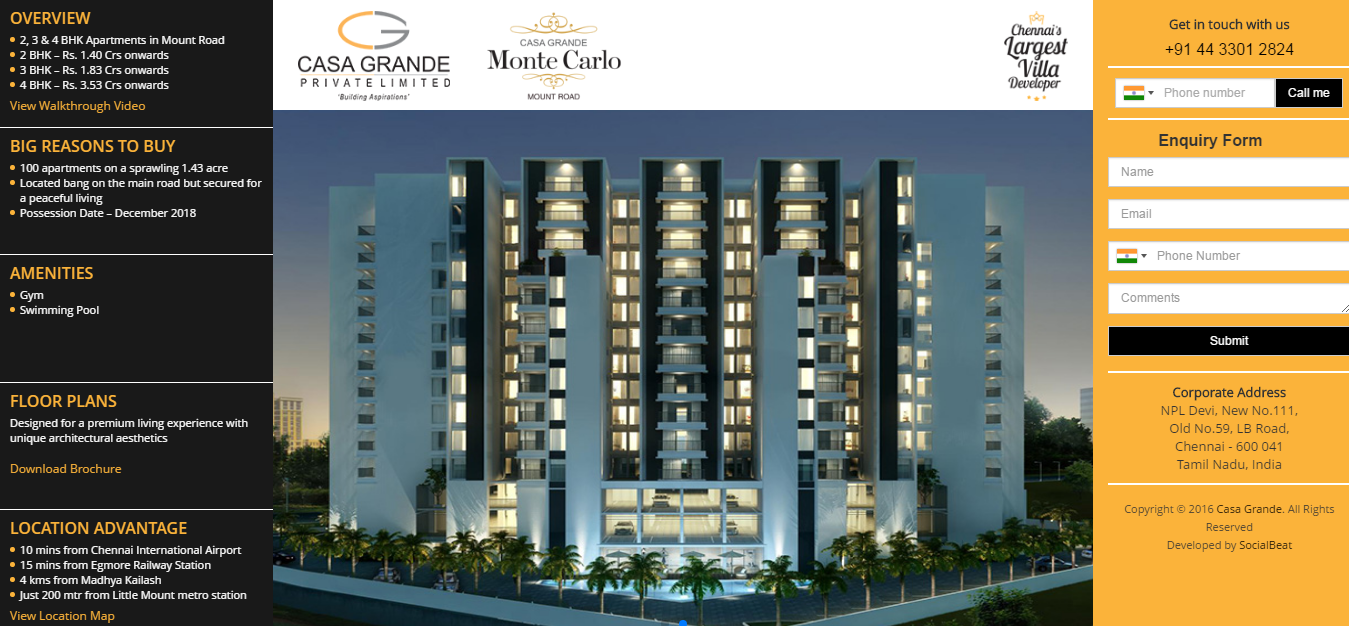
Here is a great example of Casa Grande’s Aldea. It adds prominence and proximity to the CTA.
1) Providing sliding images of the exteriors and interiors of the apartments.
2) Displaying the amenities and perks of the apartments, evidently
Having given a perfect picture of what the user is signing up for, a CTA is provided right in place for users to make further enquiries. This is a high-converting UX.
Visual Design
A well balanced design is about proper use of page elements and colors. Visually balanced designs have a positive impact on the user experience.
LaundryBoy is a winning design that puts together a great visual balance. With their website themed around blue shades, they’ve made their CTA completely stand out in a balanced contrast. Would you ever believe that a visually balanced design could lead to a 25% higher conversion rate.
Practice of Decluttering
Your landing page will always face a 5 second test to grab the user’s attention. The impact made here brings about the conversion. The Weather Channel wanted to turn people into premium subscribers. They decluttered their homepage and had a single subscription action with their features enlisted
Listen to the Users voice
Users, be it retained customers or prospective customers, have come into the habit of letting businesses know what is causing the friction. Valuing their feedback yields huge difference in your conversions.
Creating a new sign up page based on user feedback, raised the revenue for SEO Moz by additional $1million.
Your users are adapting to trending designs, which is why your designs has to update as per contemporary standards or be even better.
With a great UX - make them an offer they can’t refuse
A lot of research has been done around the impact of design on content. Recent studies on cognitive psychology states that people are moving from text-driven content towards visually mediated content.
Content is more strong and easily assimilated, when accompanied by informing design/images.
Olympia Grande makes the right use of content and images to showcase the strength of their residential project. By placing prime information like project overview, cost and enquiry in a compact space of the user focus, they’ve got the user’s attention. That's a winning strategy for quick conversions!
UX impacts SEO which in turn impacts your sales
A good UX makes your website accessible, useful, usable, findable, credible and valuable. All of this impacts the SEO positively, leading to a good ranking on search engines. A website that is optimized with quality content and good experience, will gain customer traffic and succeed at customer retention.
It is wise to learn from others mistakes; it’s a faster path to move ahead. Bad UX is mostly about doing the basic functionalities wrong. So in addition to demonstrating what works, let me point out what doesn’t.
Common Issues in UX that break sales
Research studies in UX have shown that 88% of the visitors do not visit a website that has given them a bad experience.
As you see, UX is an integral part of a business website bridging your customer to your business. Understanding the usage pattern of your users gives an insight into their experience, learning what part of your website frustrates or confuses them helps incorporate some necessary changes to the website to get better conversions.
With a lot of companies investing in UX, it is evident that the user’s experience with a website is having a soaring impact on the sales and revenue.
Here’s wishing your user eXperience a good health!
“Page abandonment increases with every second longer it takes for your website to load”
You just created the sleekest website on WordPress that has a super responsive user interface and killer content, but you’re not getting any conversions! It all boils down to page load time at the end of the day. No matter how wonderfully you craft your website, if your page loads slowly, your visitor will navigate away. They’ll navigate to an uglier website with terrible content but that loads quicker. You don’t want that.
Page abandonment increases with every second longer it takes your website to load. All hope is not lost, however. With just a few simple and easy to implement ideas, take your tortoise of a webpage and give it a turbo boost.
First of all, test your website’s load time with this handy tool from Pingdom or pagespeed from Google. Does your website pass the 2-second rule? According to several surveys that a Kissmetric article researched, most web users look for a website that loads within 2 seconds. The longest they’ll wait is 3 seconds! Any longer than that and your page needs heavy optimizing.
Before reading any further make sure you have a good server and has servers based in India (if you are targetting the Indian market. We would recommend Bluehost for a shared Linux hosting or a Wordpress optimised hosting if your site is on Wordpress.
So you’ve run the test for your website and it’s pretty slow. What next? Check out these scientifically-backed tips to improve your website’s speed.
Yes, implement LazyLoad into your website design to improve the amount of time it takes for your site to load. With LazyLoad, you can cut back on the page load time, and allow users to save their bandwidth. Win-win for all!
Images (in sizes) are indirectly proportional to any website speed. Bigger the image, slower the loading, best solution is to compress images without losing quality. You can use free image compression tools like Caesium to compress images without losing much of its sharpness & clarity. In wordpress, there are plugins like Smush.It or Ewww Image Optimizer which use lossless/lossy method to optimize the images. The great thing about these plugins is that they work in the background every time you upload a new image you can also run it retrospectively on all of the images uploaded to your media library. They come with limitations that the base image should not be more than 1mb in size (so Caesium can be used to compress initially).
The WP-Optimize plugin allows you the freedom to optimize your MySQL database with just a click!
Want to be a cache-all master? With the W3 Total Cache, make caching a breeze. This will let your website load at blazing hot speeds, and ultimately lead to better conversions and leads. It can take care of elements like browser caching, Javascript, CSS & HTML Minification, setting expiry headers etc. Be careful in using the tool as it can affect your design & CSS files too.
Are your images, content, Javascript code and CSS in the same location? Consider having them on external files via a Content Delivery Network (CDN) like Cloudflare for the same.
Want a winning idea for speeding up your website? Reduce or get rid of cookies altogether. Your visitor will also be thankful that cookies don’t bog their system down.
Don’t redirect. When you redirect your visitor to another page, you’re only adding an additional HTTP which makes your page load slower.