With thousands of brands vying for attention online, it is essential for companies to have a personality that cuts through the crowd and capture their target audience. A brand personality is a set of human characteristics that are attributed to brands in a way that they look, feel and interact with their audience. It is important to note that the personality should be an extension of the core values of the brand – and not conflict with it. For example, a luxury company may not find the greatest success littering their social feeds with memes, and a more fun brand may not be able to connect with its audience through stark and minimalist ads.
With more and more businesses going digital, and having a diverse social media offering, there is a strong correlation between a well thought-out brand personality and success. From designing online ads to creating a mobile responsive web design, having a compelling digital personality has many benefits, pushing brands to shift from print to digital media. A few of the benefits are discussed below:
- Digital touchpoints amplify the ability of a brand to communicate with its customers in comparison to Brick and Mortar and offline activations. There are a multitude of opportunities for a brand to be able to extend its personality across these touchpoints in increasingly unique ways, providing a seamless visual experience.
- It defines the brand in a way that purely offline activations cannot. Websites are no longer just a place to find your nearest store location (in the case of a product company) and have evolved to telling company stories, supported with rich media and some truly great user experience.
- It creates a cohesion for online/offline communications
- It forms an emotional connection with the users through exhibiting personality traits that they themselves would want to imbibe. Thus, it forms a bond of trust and authenticity.
In all this, the heart and soul of a digital personality comes down to one thing – design. The bare minimum of any successful communication that a brand puts out is good graphics, proving that design helps tell a brand story. Here are 10 tips to ensure that your brand voice is distinctive and visually arresting:
Establish your identity through visuals
Creating a design system or a brand book is the first and most important step to ensure that you have a holistic vision for your personality. Your brand is a living, breathing organism and should be treated as such!
Many companies prefer for their image-based communications to have subtle (or heavy!) branding on them, to ensure that it is associated back to their brand. It could be adding a simple frame, an adapted logo or even a specific filter to the image that is used throughout a campaign. It gives a lift to an otherwise simple image.
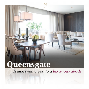
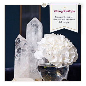
Featured above are the social media posts by House of Hiranandani. Since the brand specializes in premium and stylish living, their use of visual marketing ideas bursts with personality and originality, done in a creative and subtle way.
Think about Typography
Typography, or the art of arranging type, is a powerful element of visual communication. Gone are the days where we relied on Comic Sans or Papyrus to get our points across. Brands are now restricting themselves to using a few signature fonts in their style sheets – either using previously existing ones, or creating new ones, especially for their communications. Fonts communicate a variety of emotions and each type group is often associated with a certain kind of brand or industry. Brands that show restraint in font usage in their communication have much more focused messaging than those who get a bit too experimental with mixing type.
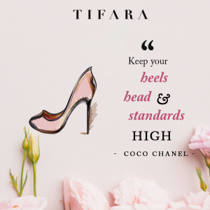

In the above examples, the serif fonts have been used to communicate a classic, timeless style that is usually associated with fashion. The brands featured here, Tifara and Zaamor, tend to favor these styles in their imagery as it best aligns with their tone and personality.

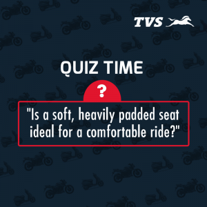
Before – These TVS creatives do not show strong brand characteristics. As an energetic automobile brand, the fonts used to not communicate this through their imagery.
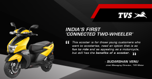
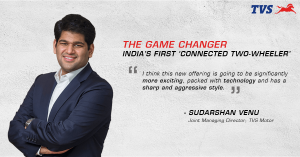
After – After establishing a font palette with visual hierarchy of text, the creatives look as though they are part of the brand. The font choice (Euromode) pleases the eye and suggests movement, speed and progress.
Choose the right palette
The term ‘Colour Psychology’ has been around the marketing space for a while, as studies show that certain colours affect online consumer behaviour. Along the same lines, businesses are realising that using a specific set of colours in their digital communications (be it their website, Google ads, infographics or social media posts) creates retention in the customer’s mind and links the graphic back to their brand. These could even be colours that are used in a product’s packaging. We’ve seen this many times with the classic Cadbury purple, the Tiffany Blue or the McDonald’s red and yellow. There is a strong association with these colours to their corresponding businesses and products, which let the RGB and CMYK take on a whole new meaning!


Sundaram Mutual, one of our clients in the financial sector, uses tones of blue and white in their social media creatives to bring about brand recall.


The above examples illustrate perfectly how a recognizable color palette can make a graphic distinctive without the need of a logo. It goes without saying that these are made for Google.
Motion graphics and cinemagraphs
Motion graphics are proving to be more and more popular when pitted against their static counterparts. They stand out from our newsfeeds and demand a second look. Brands are getting increasingly creative when it comes to using subtle motion in design. Cinemagraphs are the latest trend in this area – a post where only one aspect of an image is in motion in contrast to a static background.
GIFs are being redefined as more than just a grainy set of images on loop, found on 9Gag. They are quirky, clever representations of concepts that could otherwise not be depicted by a single image post. They are also easily shareable across multiple social media platforms. Companies are able to create a personality through these small clips. Brands are no longer thinking in terms of just static images, they are thinking and communicating in terms of stories.
Storytelling through video content
Videos are the most heavily consumed form of content in the online space. Over half a billion people are watching video content on Facebook on a day-to-day basis. Weekly share of time spent watching TV and video on mobile devices has grown by 85% from 2010 to 2016, according to a report by Edelman. Because of this, brands have intuitively funneled a lot of their budgeting into video content for brand storytelling, promotions and ultimately, conversions (95% of a message is retained when it is portrayed through video versus text).
However, not all videos are created equal, and brands are becoming increasingly intuitive of this point. As the newsfeed develops more and more into an online billboard, it is essential to craft content to best suit the platforms. Square videos are consumed the most, as they take up 78% more space on Facebook’s newsfeed and get more engagement than horizontal ones.
The kinds of content routes that companies take are also varied – but they all stay true to the brand message. This just goes to show that one brand can have many facets to its personality – ranging from a lively, engaging side shown through Vox pop to a ‘strictly business’ side though branded videos. Whatever said and done, video content is here to stay – whether it is low-cost videos to tell a brand story or optimized YouTube videos for customer engagement.
Be mindful of what shapes communicate
Shape, or form, is another visual element that holds a lot of importance. Social media marketing has allowed brands to communicate with their customers like never before – and in extremely creative ways. Some even have a specific style of graphic art that is so distinctive, that the viewer immediately knows which brand it came from. Different shapes, willingly or unwillingly, mean different things. Organic, soft and rounded shapes give a friendly, relatable and pleasing feel.


For example, in the Dr. Mohan’s graphics above – the emotion of stress has been personified into a fun character to communicate to people how to be more aware of letting stress take over your life. The tone is light, to get across a more serious point – thus trying to get into the mind of the customer and make them relate to the creatives on a personal level rather than giving them complex medical advice.
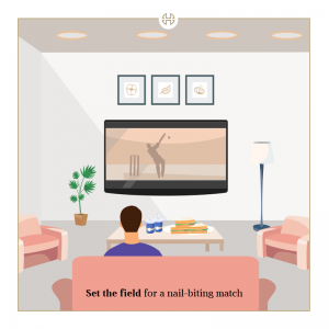
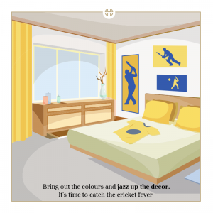
Sharper, geometric shapes communicate a bold, clean and prestigious outlook. In the creatives done for House of Hiranandani, the tonal vectors used have a minimalist feel which is to communicate the perfection and luxury of their interiors, while still keeping it relevant to social media.
Knowing what your brand intends to communicate should line up with the shape and form of the elements used in all communications to ensure consistency.
Microinteractions
There are hundreds of tiny interactions that users face, a majority of which don’t even get noticed. Through brilliant user experience, there are subtle motion design decisions made by developers that try to influence behaviour and make the process or task simpler. These are microinteractions and if done well, shouldn’t even be on the radar of the user. For example, the pull-to-refresh option on Facebook is something that we subconsciously do over other apps as well – and expect the same result. A brand that is fully aware of the spectrum of its interactions with the customer, and is focused on making the purchase funnel or journey as smooth and easy as possible, gains legitimacy and trust.
Illustration styles (Flat vs Sketches)
Flat design and vectors were predicted to be one of the graphic design trends of 2018. Brands are hiring graphic artists to create beautiful flat illustrations to increase lead generation through their landing pages. Tech companies, real estate and even large conglomerates alike are going with this approach instead of a traditional full-width hero image banner. It adds a fun element to the page and certainly draws the user in. Corporates are no longer trying to make their communications stuffy and pompous. This works well especially in the case of businesses with heavy processes or complex offerings – it simplifies it and makes it much less intimidating for the viewer, improving the quality of leads in the process.


Customising the design style for each platform
Facebook, Instagram, Twitter, LinkedIn, YouTube – Chances are, your company has at least two, or even all of these, active. Each one has a slightly different target audience, although many overlap. It is essential to rework the visual communication for each one, so that it is the most effective for that particular platform. Companies that do this certainly get a nod of approval for social media savants – as merely resizing a creative does not mean that it is ready-to-go for a certain platform. Rearranging the copy, the caption, the graphic, ensuring that the Call-To-Action is at the most optimal place – all these are important factors to keep in mind.
Adding regional accents to design
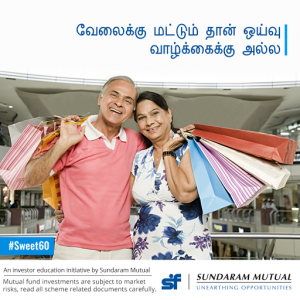
The Indian digital space is extremely diverse – and there is a growing need and appreciation for regionally targeted content and design. Companies in real estate, B2B, finance and FMCG, to name a few, have realised that using the same communication all across the country does not speak to every consumer – not just in terms of the base translation of copy, but the design and graphics as well. By using regional touches and local nuances to the design, the same ad can penetrate the tier 2 and tier 3 market in a much more effective way, and engage with India’s next billion Internet users. It also rouses a sense of pride amongst the customers as they feel represented.
This can be done by changing the color palette to better suit the aesthetic that a certain city is known for (like pink for Jaipur), include nods to monuments and local figures in that region (like Ranjikanth or temple architecture for Chennai) or even film dialogues woven into the creative copy.
This shows that the company is not only invested in the citizens of a certain area or state, but is willing to go the extra mile to build a relationship and start a conversation with them. You can read our case study on how a multilingual approach got a brand 90% growth in leads to understand the reach of regional design.



A modern brand is an entity of many moving parts – some tangible and visible, but others are just a result of good design decisions made, that make a world of difference. As the points above lay out – it is extremely important to pay attention to not only the messaging of your brand, but the way that it is being depicted for communication and consumption. Providing your brand with a strong personality and voice is the best investment in the short and long term!
You can also check out our case study on how a redesign strategy helped a brand increase social engagement for more insights.
For further information, here’s our Creative Head – Panisa Shah to take you through design tips to improve social media ROI.

